Netflix Connect
Netflix Connect
Improving content discovery on streaming platforms
Improving content discovery on streaming platforms
Timeline
Timeline
Timeline
5 weeks
5 weeks
5 weeks
Industry
Industry
Industry
Entertainment
Entertainment
Entertainment
Platform
Platform
Platform
Desktop website
Desktop website
Desktop website
Services
Services
Services
User research
Product strategy
UI design
Usability testing
User research
Product strategy
UI design
Usability testing
User research
Product strategy
UI design
Usability testing
The problem
The problem
We've all spent too long scrolling through Netflix, only to give up and rewatch something familiar. This is the paradox of choice in action—having so many options should make finding something to watch easier, but instead leads to decision paralysis. Research shows users spend 48 minutes per week just deciding what to watch—that's 112 days across an adult lifetime spent choosing content.
We've all spent too long scrolling through Netflix, only to give up and rewatch something familiar. This is the paradox of choice in action—having so many options should make finding something to watch easier, but instead leads to decision paralysis.
Research shows users spend 48 minutes per week just deciding what to watch—that's 112 days across an adult lifetime spent choosing content.
We've all spent too long scrolling through Netflix, only to give up and rewatch something familiar. This is the paradox of choice in action—having so many options should make finding something to watch easier, but instead leads to decision paralysis. Research shows users spend 48 minutes per week just deciding what to watch—that's 112 days across an adult lifetime spent choosing content.
The solution
The solution
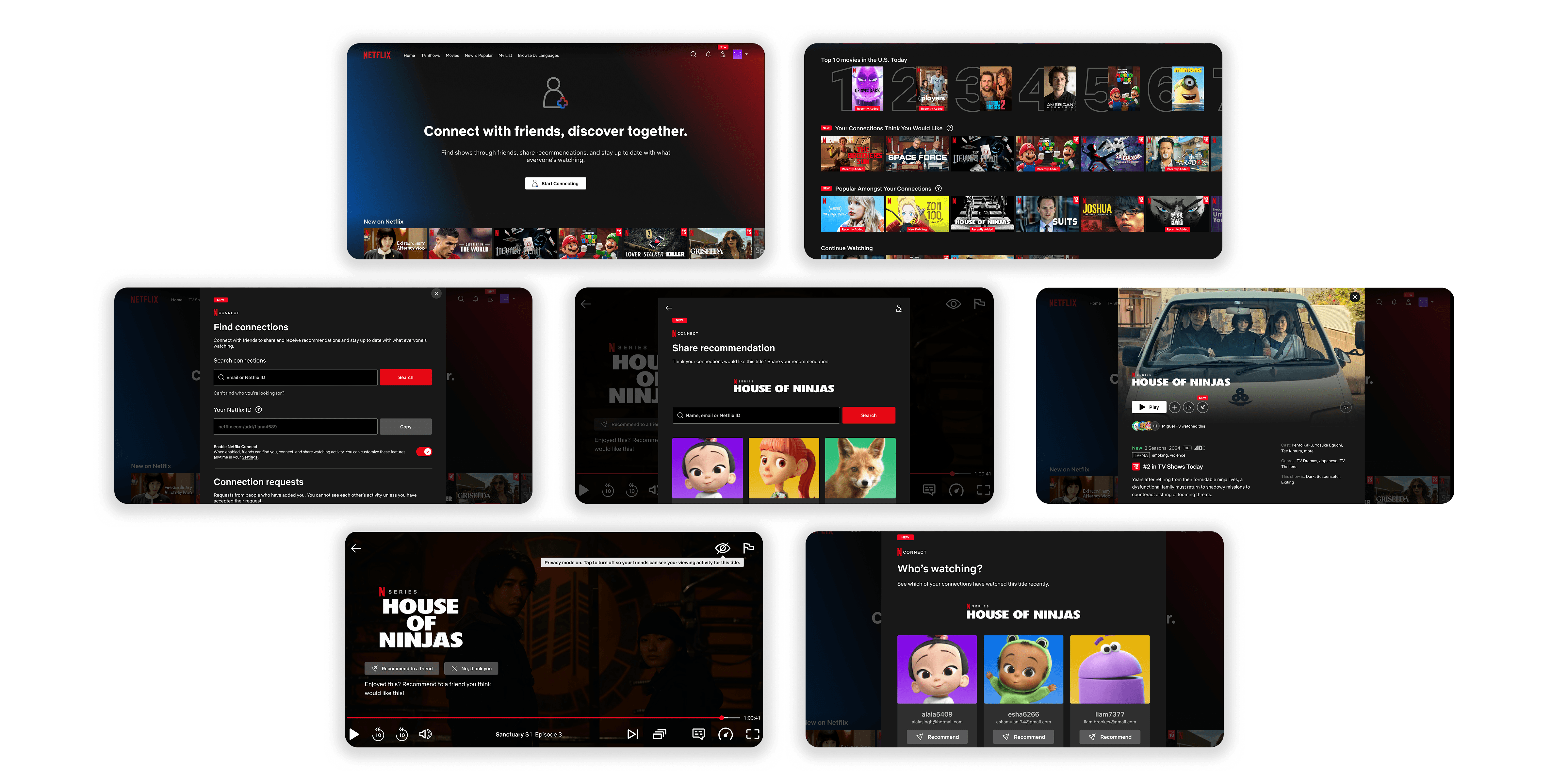
Netflix Connect is a social discovery feature that enables users to share and receive recommendations and view friend activity directly within Netflix. By integrating the recommendation system users already trust most—their social networks—the feature replaces generic algorithmic suggestions with social proof from people who know their taste best.
Netflix Connect is a social discovery feature that enables users to share and receive recommendations and view friend activity directly within Netflix.
By integrating the recommendation system users already trust most—their social networks—the feature replaces generic algorithmic suggestions with social proof from people who know their taste best.
Netflix Connect is a social discovery feature that enables users to share and receive recommendations and view friend activity directly within Netflix. By integrating the recommendation system users already trust most—their social networks—the feature replaces generic algorithmic suggestions with social proof from people who know their taste best.
MY INITIAL HYPOTHESIS
MY INITIAL HYPOTHESIS
MY INITIAL HYPOTHESIS
People aren't donating because they can't track their impact. If I can solve the 'what happens after I donate?' question, I can unlock an audience of donors who are blocked by this uncertainty.
People aren't donating because they can't track their impact. If I can solve the 'what happens after I donate?' question, I can unlock an audience of donors who are blocked by this uncertainty.
People aren't donating because they can't track their impact. If I can solve the 'what happens after I donate?' question, I can unlock an audience of donors who are blocked by this uncertainty.

THE 5-MINUTE VERSION
THE 5-MINUTE VERSION
DISCOVERING THE WHO, WHAT, WHY
DISCOVERING THE WHO, WHAT, WHY
Understanding the bigger picture (literally)
Understanding the bigger picture (literally)
I started by analyzing major streaming platforms—focusing mainly on their content curation and presentation.
I started by analyzing major streaming platforms—focusing mainly on their content curation and presentation.

Netflix
Netflix
👍
Vast content library with constant updates, providing variety across genres and formats
Vast content library with constant updates, providing variety across genres and formats
👎
Algorithm suggestions can feel inconsistent, repetitive and random
Algorithm suggestions can feel inconsistent, repetitive and random

Prime Video
Prime Video
👍
Extensive content library with regular updates, providing diverse content
Extensive content library with regular updates, providing diverse content
👎
Interface cluttered by mixing paid and free content, making navigation and discovery confusing
Interface cluttered by mixing paid and free content, making navigation and discovery confusing


Disney+ & Apple TV+
Disney+ & Apple TV+
👍
More focused content libraries with higher-quality, consistent content
More focused content libraries with higher-quality, consistent content
👎
Limited content breadth and slower rollout schedules restrict variety and discovery options
Limited content breadth and slower rollout schedules restrict variety and discovery options
THE OPPORTUNITY
THE OPPORTUNITY
While each platform faces unique challenges, the universal struggle with content discovery reveals a significant gap in the market waiting to be addressed.
While each platform faces unique challenges, the universal struggle with content discovery reveals a significant gap in the market waiting to be addressed.
Interestingly, the most successful discovery patterns came from indirect competitors like YouTube and Spotify, both of which offered strong personalization algorithms and social discovery features.
Interestingly, the most successful discovery patterns came from indirect competitors like YouTube and Spotify, both of which offered strong personalization algorithms and social discovery features.
Behind the scenes of user behaviour
Behind the scenes of user behaviour
With the context from the secondary research, I interviewed 6 regular users of Netflix and other streaming platforms. The research revealed two distinct user behaviours when it comes to finding something to watch:
With the context from the secondary research, I interviewed 6 regular users of Netflix and other streaming platforms. The research revealed two distinct user behaviours when it comes to finding something to watch:
the browsing spiral
the conFident click
Open Netflix with no title in mind
Hear about title from friend/social media buzz
Open Netflix to search for specific title
Watch with confidence backed by social proof
Most of the time, genuine satisfaction/enjoyment
Scroll through suggestions provided by algorithms
Watch several random episodes/trailers to test quality
Abandon search/watch something familiar
Watch something hit or miss
the browsing spiral
the conFident click
Open Netflix with no title in mind
Hear about title from friend/social media buzz
Open Netflix to search for specific title
Watch with confidence backed by social proof
Most of the time, genuine satisfaction/enjoyment
Scroll through suggestions provided by algorithms
Watch several random episodes/trailers to test quality
Abandon search/ watch something familiar
Watch something hit or miss
the browsing spiral
the conFident click
Open Netflix with no title in mind
Hear about title from friend/social media buzz
Open Netflix to search for specific title
Watch with confidence backed by social proof
Most of the time, genuine satisfaction/ enjoyment
Scroll through suggestions provided by algorithms
Watch several random episodes/trailers to test quality
Abandon search/watch something familiar
Watch something hit or miss
Sometimes, browsing on Netflix itself did lead to finding content, but it was often inefficient unreliable, especially compared to social recommendations from people who either knew user tastes and preferences or were similar to them.
Sometimes, browsing on Netflix itself did lead to finding content, but it was often inefficient unreliable, especially compared to social recommendations from people who either knew user tastes and preferences or were similar to them.
WHAT I DISCOVERED
WHAT I DISCOVERED
The most successful content discovery was happening outside the platform entirely —social recommendations consistently outperformed algorithmic suggestions.
The most successful content discovery was happening outside the platform entirely —social recommendations consistently outperformed algorithmic suggestions.
The most successful content discovery was happening outside the platform entirely —social recommendations consistently outperformed algorithmic suggestions.
DEFINING THE PROBLEM
DEFINING THE PROBLEM
Zooming in on the problem
Zooming in on the problem
These findings shaped my understanding of the core user I was designing for—individuals caught between wanting great content and lacking efficient ways to find it.
These findings shaped my understanding of the core user I was designing for—individuals caught between wanting great content and lacking efficient ways to find it.
Primary persona


People can give you a better overview of the show or movie than the synopsis on Netflix which is just one or two lines.
People can give you a better overview of the show or movie than the synopsis on Netflix which is just one or two lines.
Social
Social
Curious
Curious
Tech-savvy
Tech-savvy
Efficient
Efficient
Decisive
Decisive
Uses social media and review sites to find recommendations.
Uses social media and review sites to find recommendations.
why does it take me so long to find something to watch?
why does it take me so long to find something to watch?

Overwhelmed by too much choice on streaming platforms
Overwhelmed by too much choice on streaming platforms
Craves efficiency + personalisation in discovery
Craves efficiency + personalisation in discovery
DEFINING THE PROBLEM
DEFINING THE PROBLEM
How might we transform the way frequent Netflix users discover content on the platform to make the experience personalized, efficient and engaging?
How might we transform the way frequent Netflix users discover content on the platform to make the experience personalized, efficient and engaging?
How might we transform the way frequent Netflix users discover content on the platform to make the experience personalized, efficient and engaging?
IDEATING THE SOLUTION
IDEATING THE SOLUTION
Buffering through ideas
Buffering through ideas
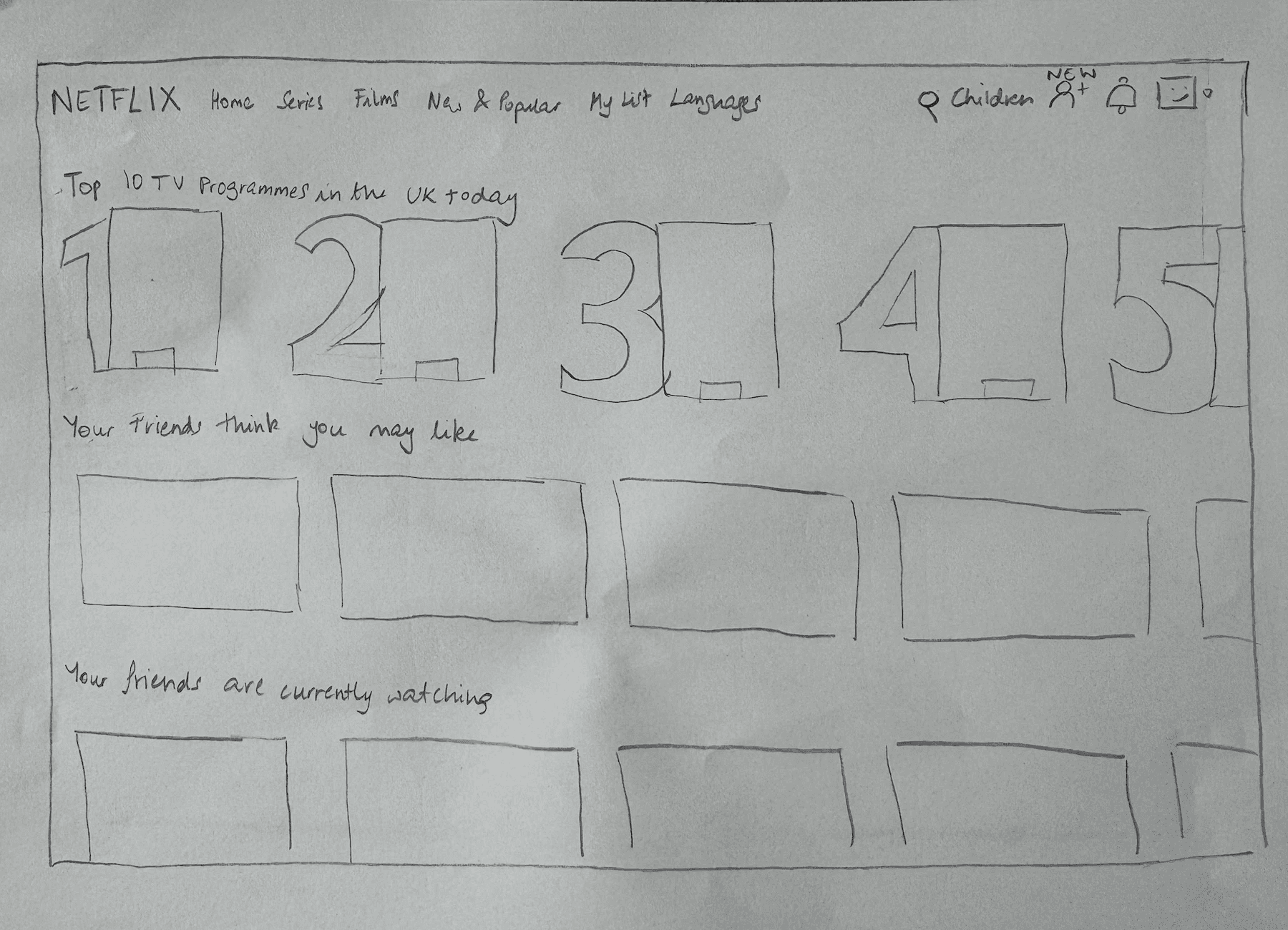
When I first started ideating, the truth is I had no idea what to build. There were so many different directions that I could take, and I couldn't pick just one. Eventually, I decided to sketch out my top 4 viable options and present them at a group critique session, hoping to get some feedback.
When I first started ideating, the truth is I had no idea what to build. There were so many different directions that I could take, and I couldn't pick just one. Eventually, I decided to sketch out my top 4 viable options and present them at a group critique session, hoping to get some feedback.
1.
1.
Enhanced filtering system
Enhanced filtering system
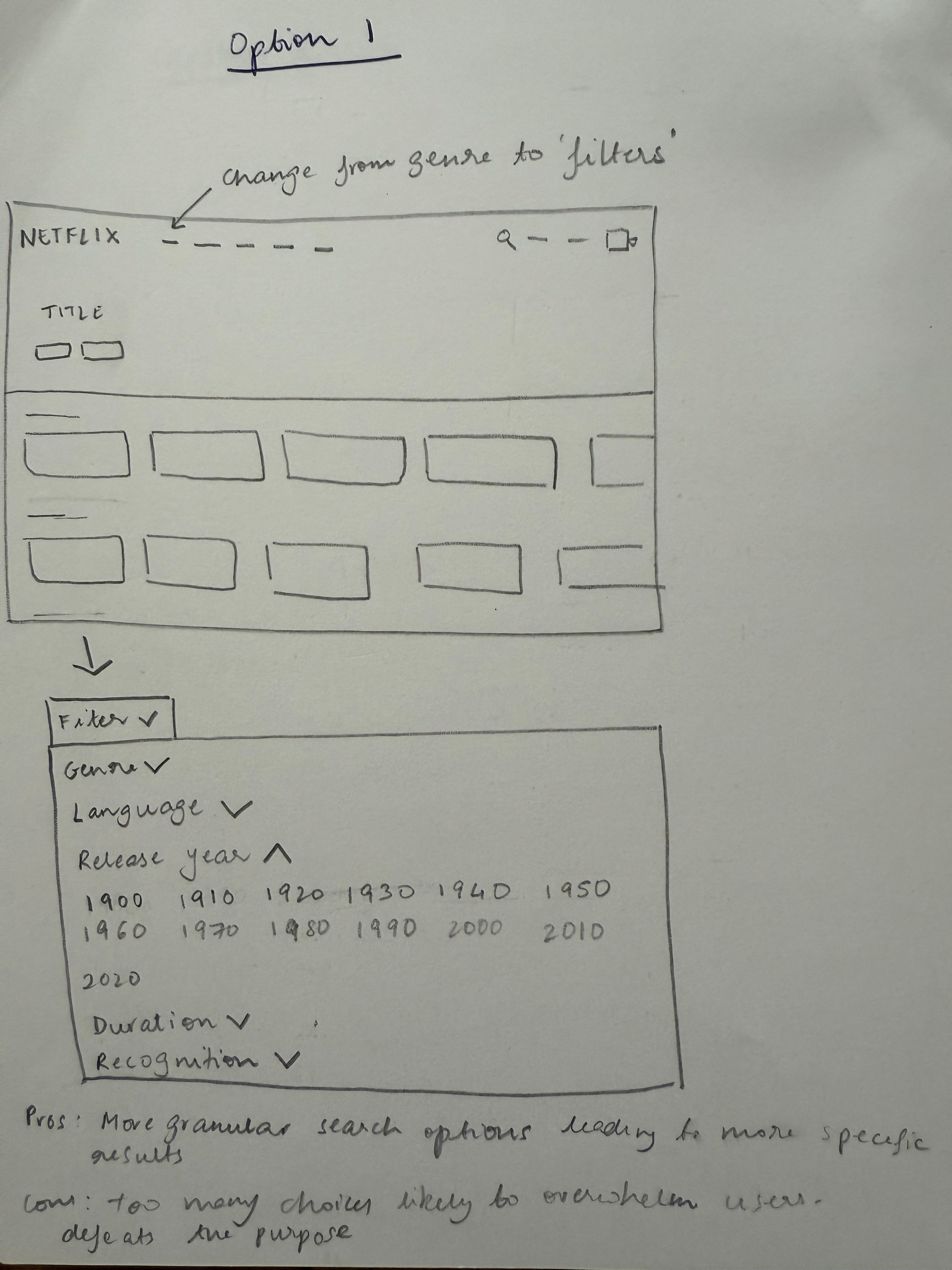
Advanced search filters by specific parameters like duration, director, and actor
Advanced search filters by specific parameters like duration, director, and actor
… but this requires users to have very specific preferences when choosing
… but this requires users to have very specific preferences when choosing
2.
2.
Mood-based discovery quiz
Mood-based discovery quiz
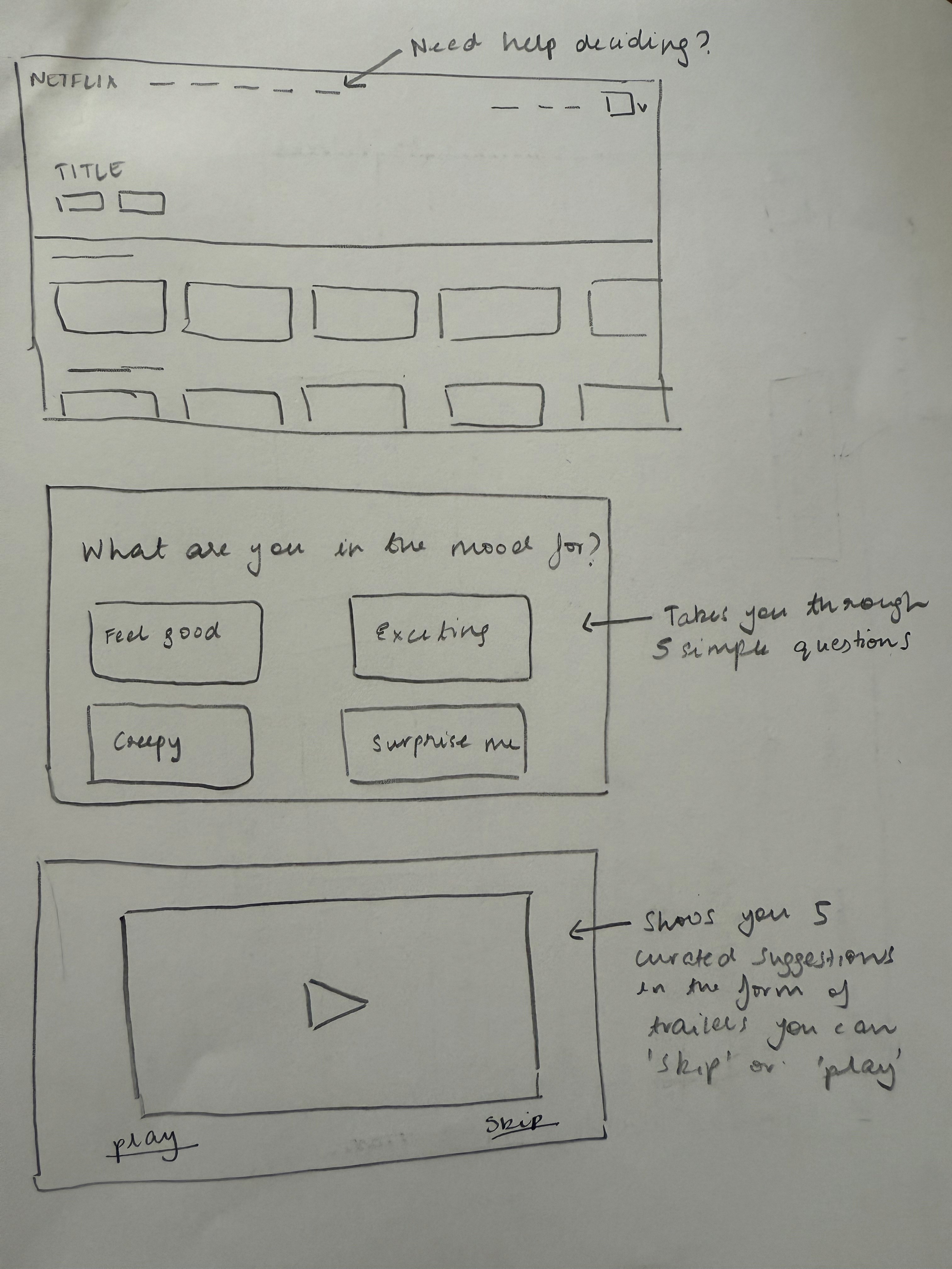
A guided questionnaire to recommend content based on current mood and preferences
A guided questionnaire to recommend content based on current mood and preferences
… but this requires significant upfront effort, especially if doing this regularly
… but this requires significant upfront effort, especially if doing this regularly
3.
3.
Viewer archetypes
Viewer archetypes
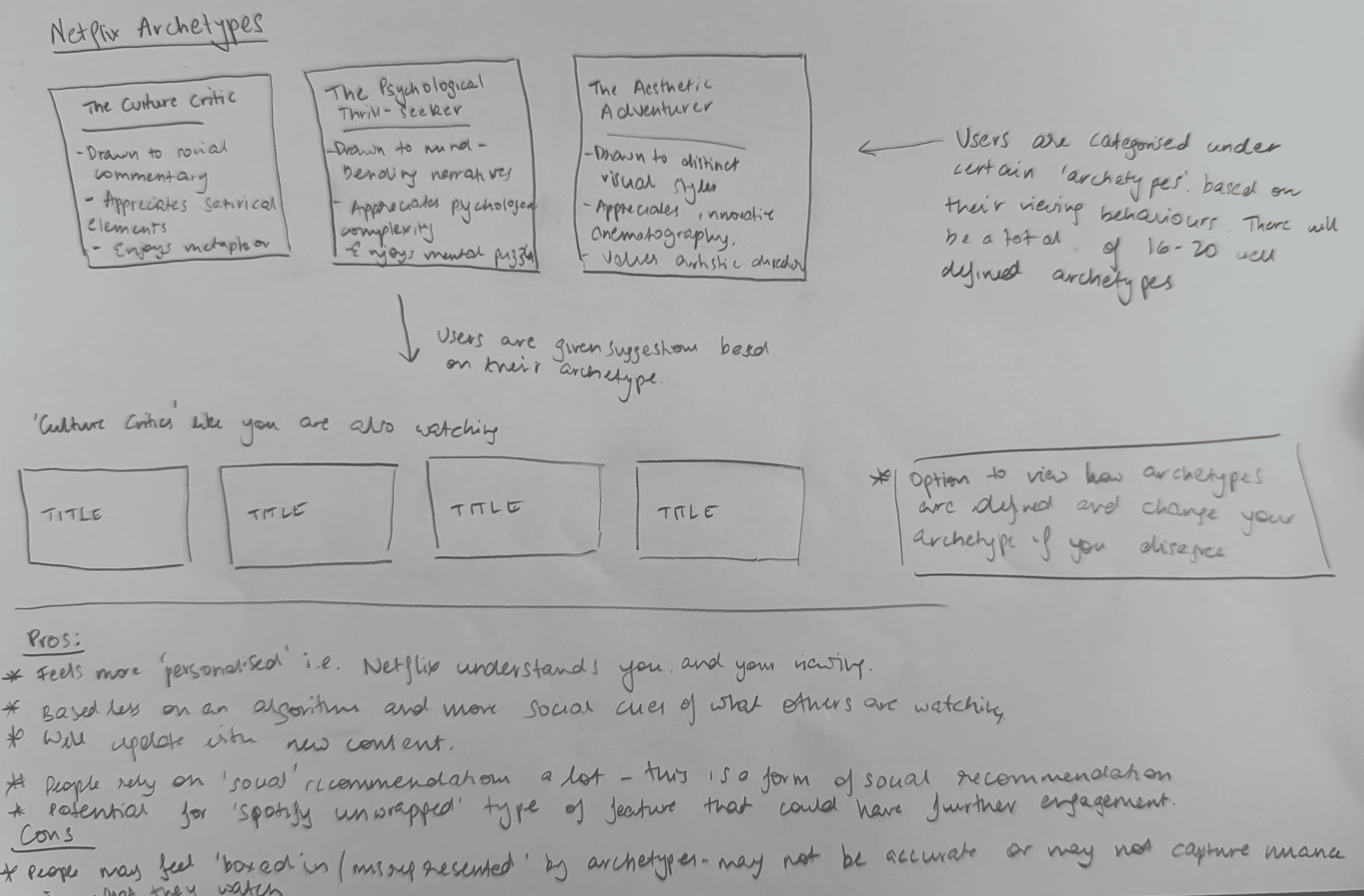
Categorise users based on viewing patterns to show recommendations from similar viewers
Categorise users based on viewing patterns to show recommendations from similar viewers
… but this isn't that dissimilar to current algorithms which don't work
… but this isn't that dissimilar to current algorithms which don't work
4.
4.
Social integration
Social integration
Enable friend recommendations and activity sharing directly on the platform
Enable friend recommendations and activity sharing directly on the platform
… this aligns with how users naturally discover content they enjoy
… this aligns with how users naturally discover content they enjoy
Social features worked because they matched how users naturally discovered great content: through trusted recommendations from people who understood their taste.
Social features worked because they matched how users naturally discovered great content: through trusted recommendations from people who understood their taste.
THE IDEATING PROCESS
THE IDEATING PROCESS
Users were already solving the content discovery problem perfectly through friends and other social sources—they just couldn't do it on Netflix itself.
Users were already solving the content discovery problem perfectly through friends and other social sources—they just couldn't do it on Netflix itself.
Users were already solving the content discovery problem perfectly through friends and other social sources—they just couldn't do it on Netflix itself.
The making of Netflix Connect
The making of Netflix Connect
I started with three core features that seemed obvious for a social discovery feature. But a few points came up during the concept testing that suggested these needed further consideration to actually work.
I started with three core features that seemed obvious for a social discovery feature. But a few points came up during the concept testing that suggested these needed further consideration to actually work.
Adding friends
Adding
friends
Simplicity in action
Simplicity in action
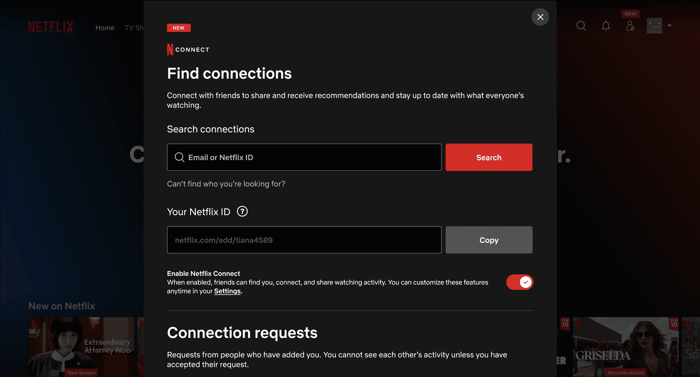
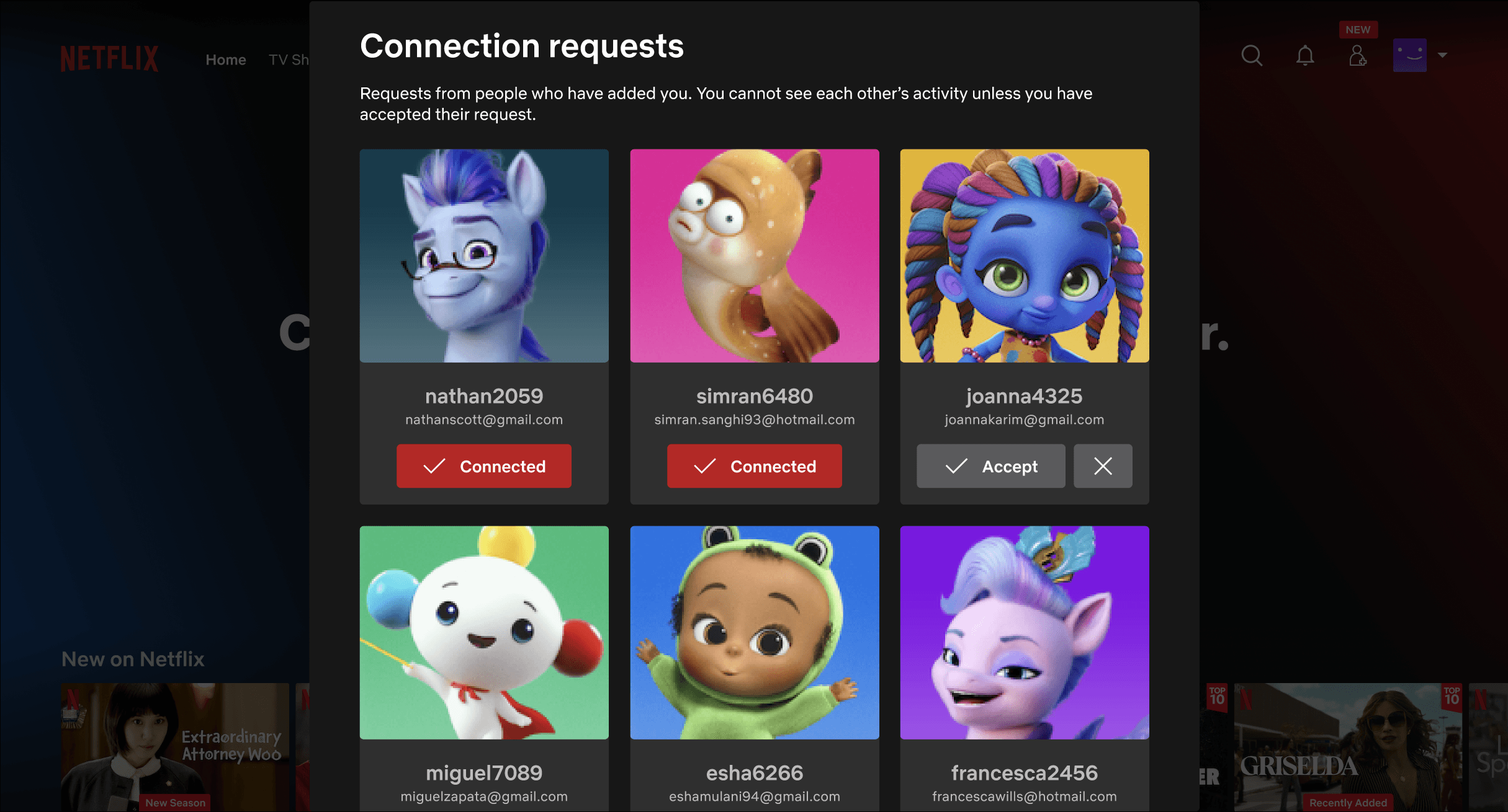
Adding contacts needed to be simple, accessible, and possible to do in several different ways.
Adding contacts needed to be simple, accessible, and possible to do in different ways.
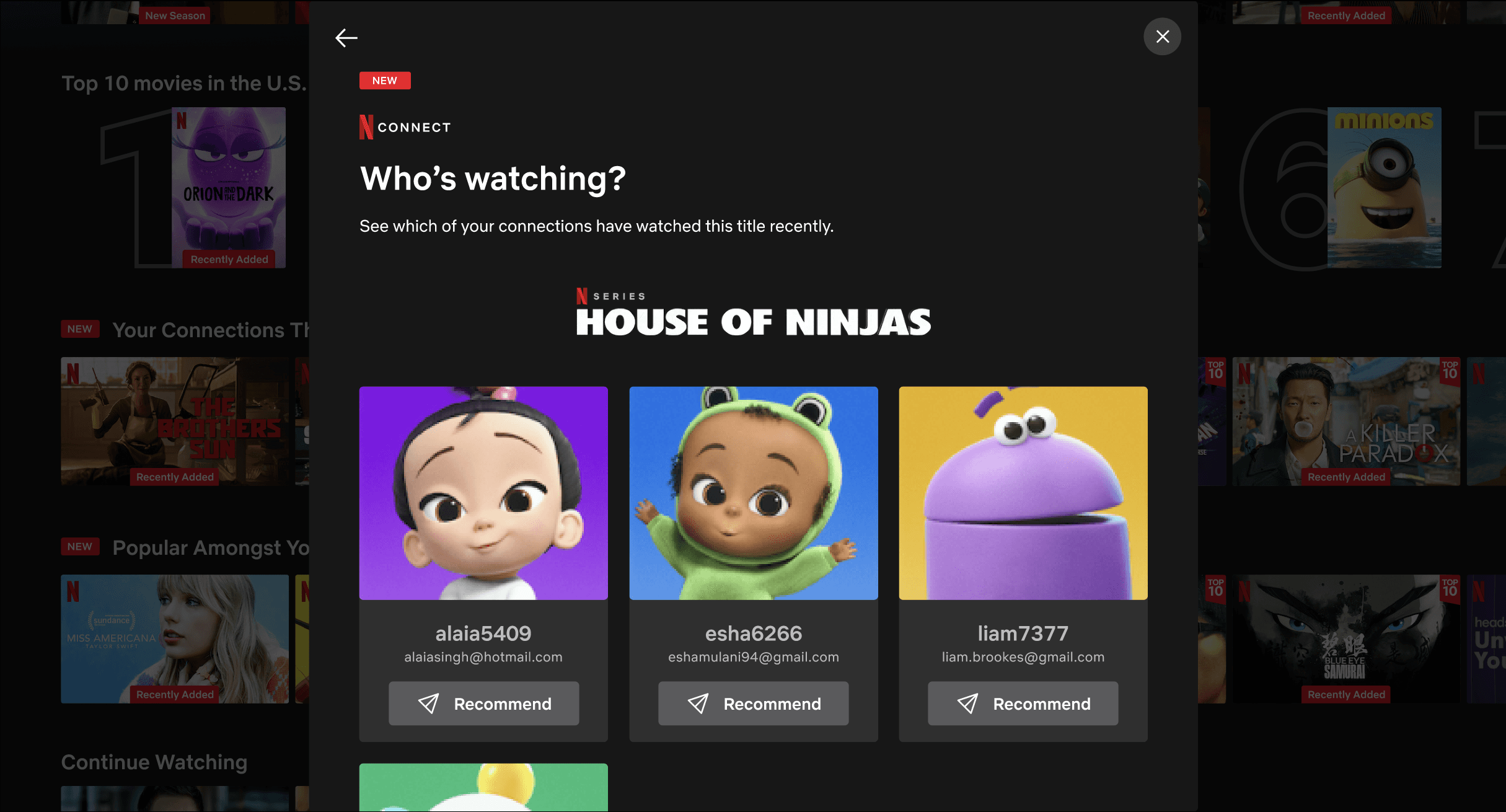
Viewing friend activity
Viewing friend
activity
Quality thresholds
Quality thresholds
Friend activity needed to reflect genuine engagement with a title.
Friend activity needed to reflect genuine engagement with a title.
Protecting privacy
Protecting privacy
Privacy controls needed to be accessible and comprehensive.
Privacy controls needed to
be accessible
and comprehensive.
Sharing suggestions
Sharing suggestions
Easy integration
Easy
integration
Recommending action needed to be integrated effortlessly into their current journey.
Recommending action needed to be integrated effortlessly into their current journey.
With these refined features in mind, I designed key user flows to ensure the social elements felt seamless within Netflix's existing experience.
With these refined features in mind, I designed key user flows to ensure the social elements felt seamless within Netflix's existing experience.
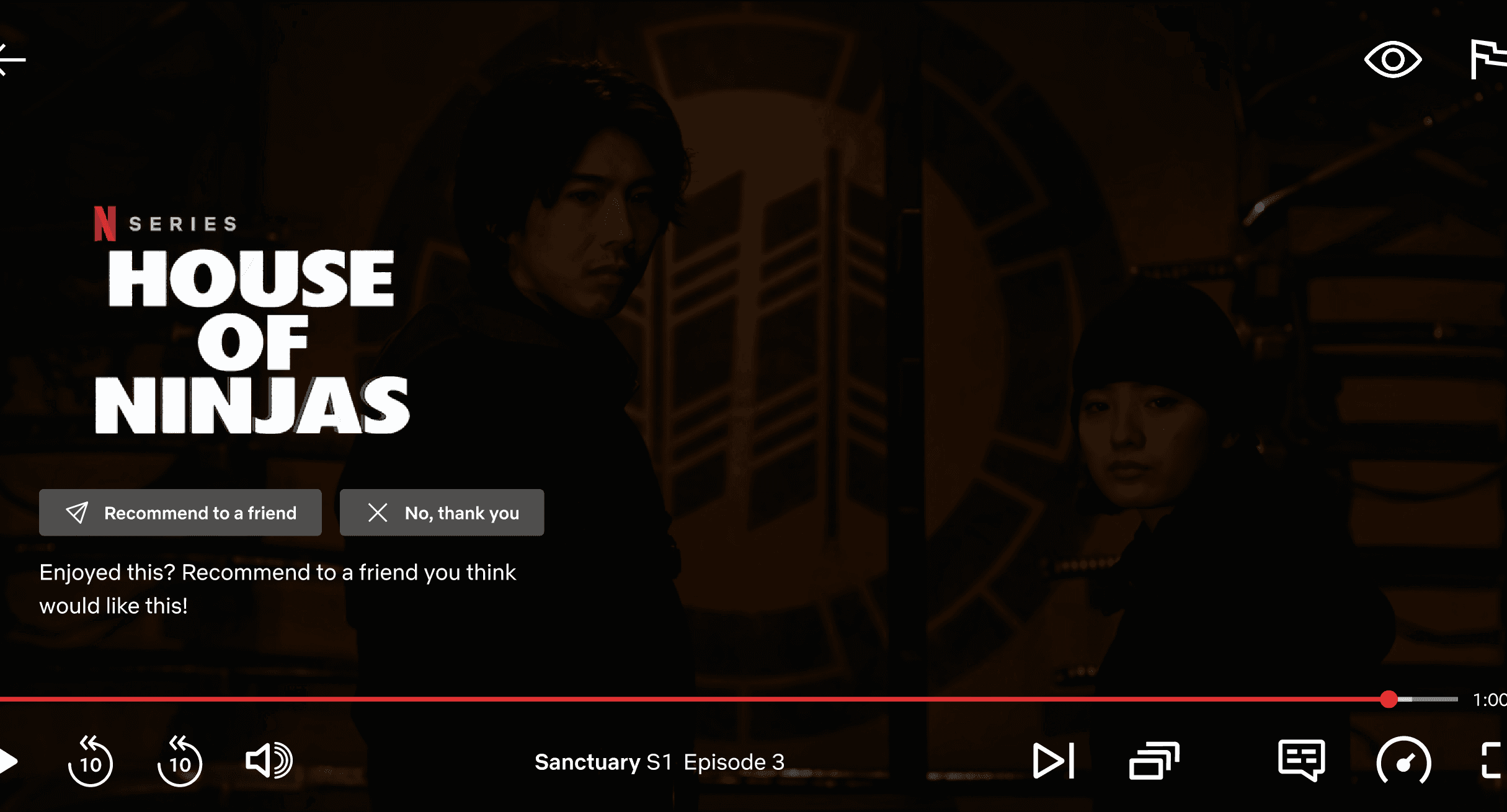
Recommend a title (pre-watching)
Recommend a title
(pre-watching)
Recommend a title (post-watching)
Send/receive friend requests
Send/receive friend requests
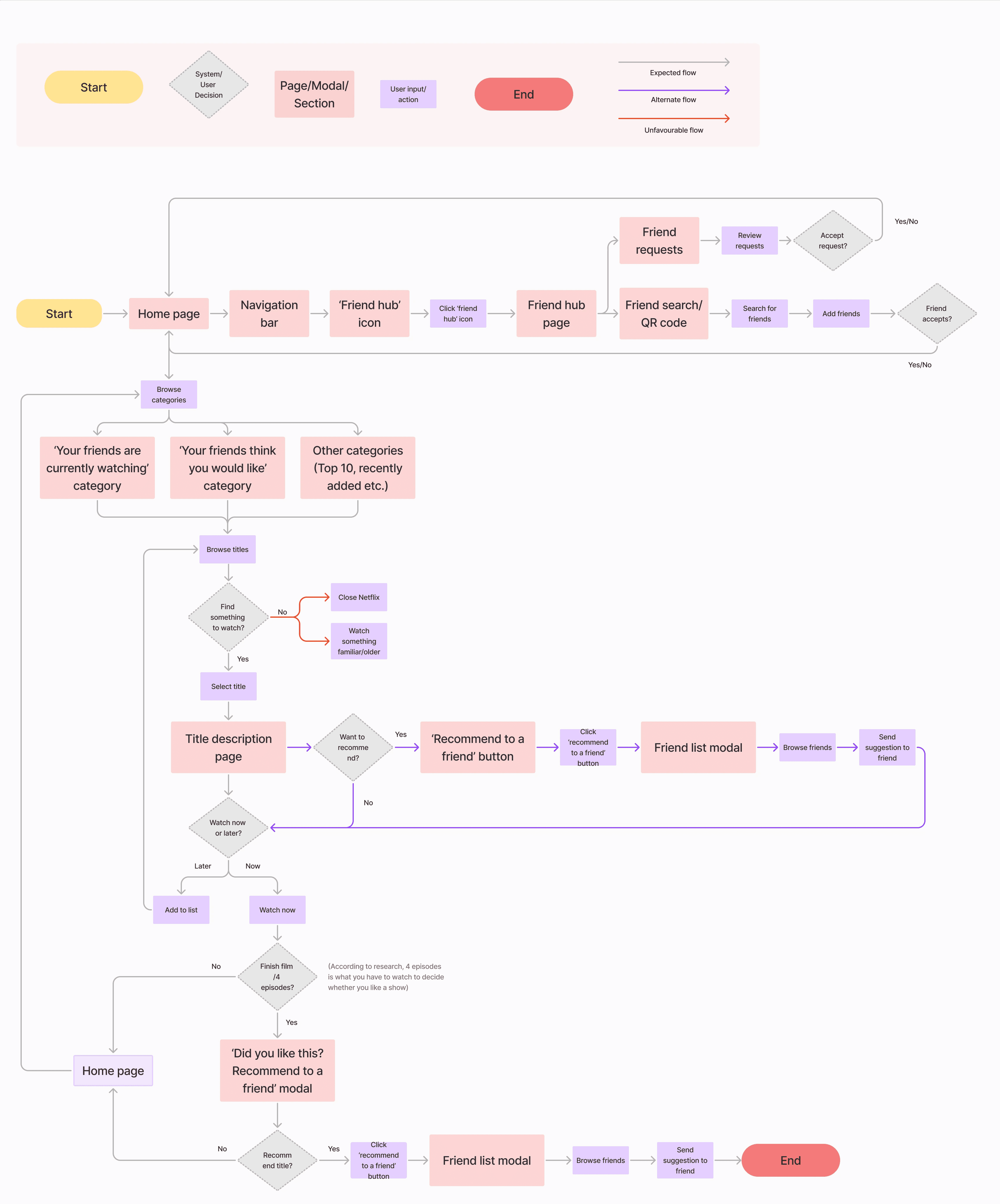
Multiple ways to add friends
Quality thresholds to ensure genuine engagement
Different touchpoints to recommend to friends
Multiple ways to add friends
Quality thresholds to ensure genuine engagement
Different touchpoints to recommend to friends
Multiple ways to add friends
Quality thresholds to ensure genuine engagement
Different touchpoints to recommend to friends
Recommend a title
(post-watching)

THE IDEATING PROCESS
THE IDEATING PROCESS
Social functionality was just the starting point—privacy safeguards, seamless integration, and quality controls would determine whether this is something users would actually adopt.
Social functionality was just the starting point—privacy safeguards, seamless integration, and quality controls would determine whether this is something users would actually adopt.
Social functionality was just the starting point—privacy safeguards, seamless integration, and quality controls would determine whether this is something users would actually adopt.
DESIGNING THE EXPERIENCE
DESIGNING THE EXPERIENCE
Becoming part of the production
Becoming part of the production
I started by closely observing Netflix's existing patterns—how they introduce new features, as well as their patterns for onboarding, navigation, and visual hierarchy. I sketched social features based on these established patterns, ensuring new elements would feel familiar.
I started by closely observing Netflix's existing patterns—how they introduce new features, as well as their patterns for onboarding, navigation, and visual hierarchy. I sketched social features based on these established patterns, ensuring new elements would feel familiar.
1.
1.
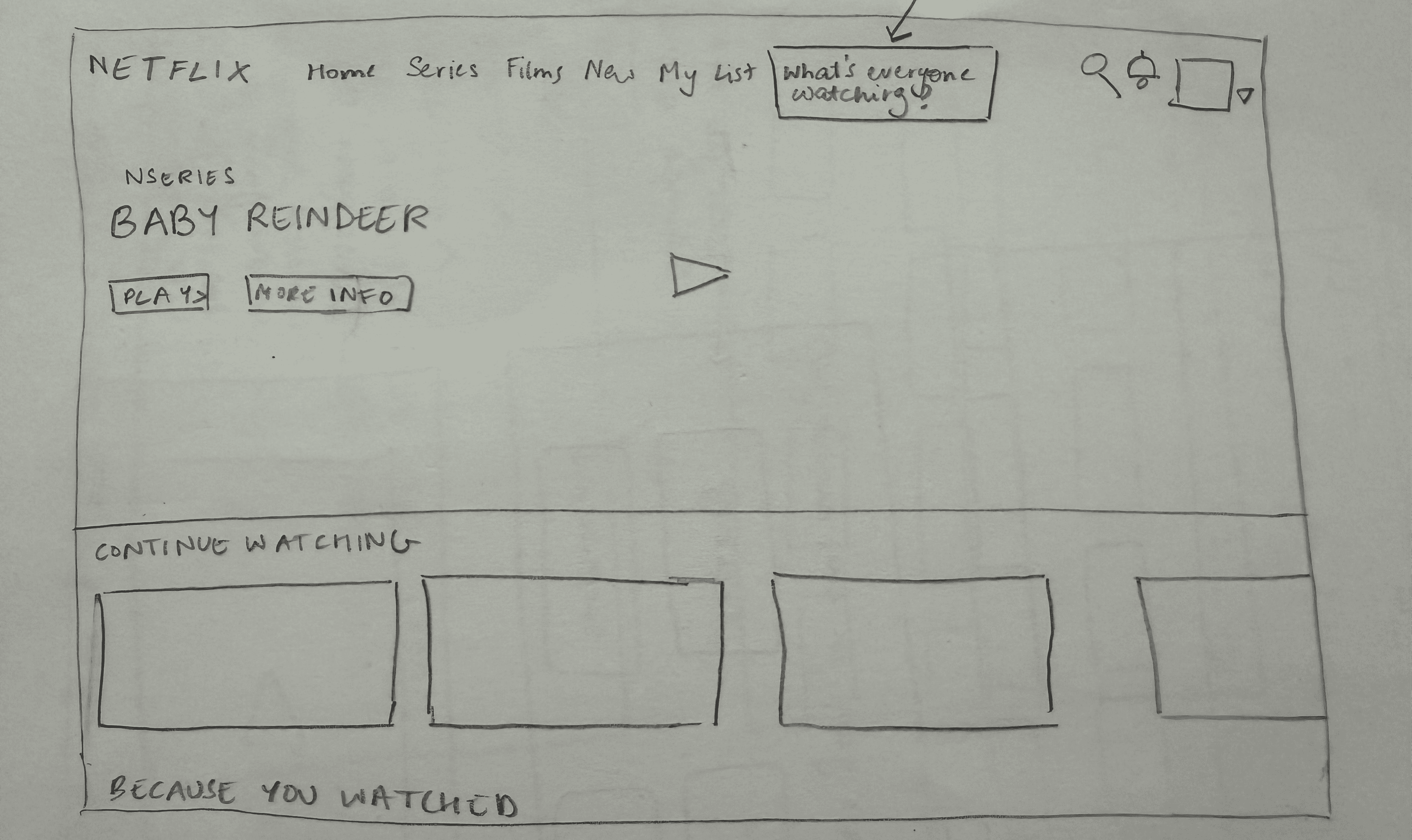
Home page
Home page
New feature introduced subtly in navigation bar
New feature introduced subtly in navigation bar
2.
2.
Add friends page
Add friends page
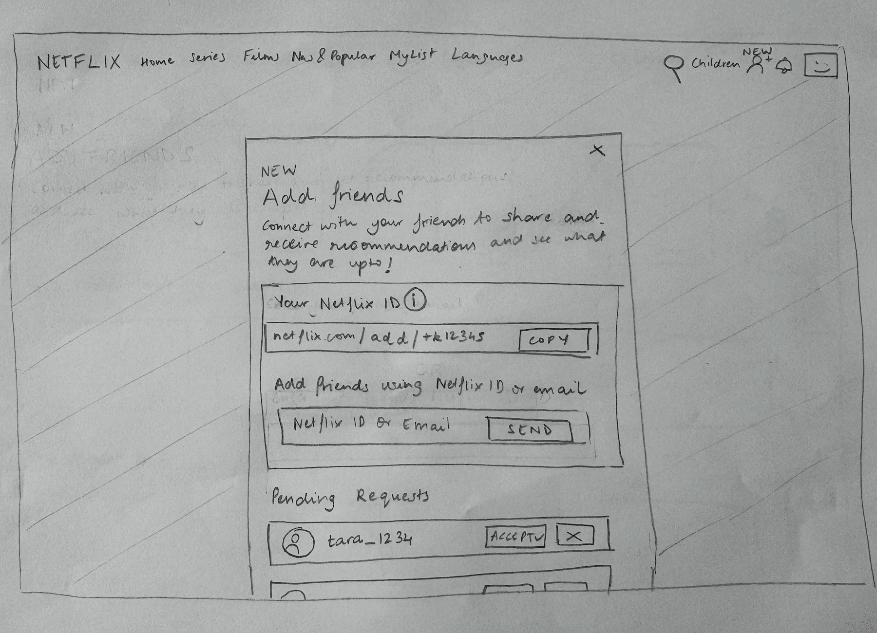
Multiple ways of adding friends provided
Multiple ways of adding friends provided
3.
3.
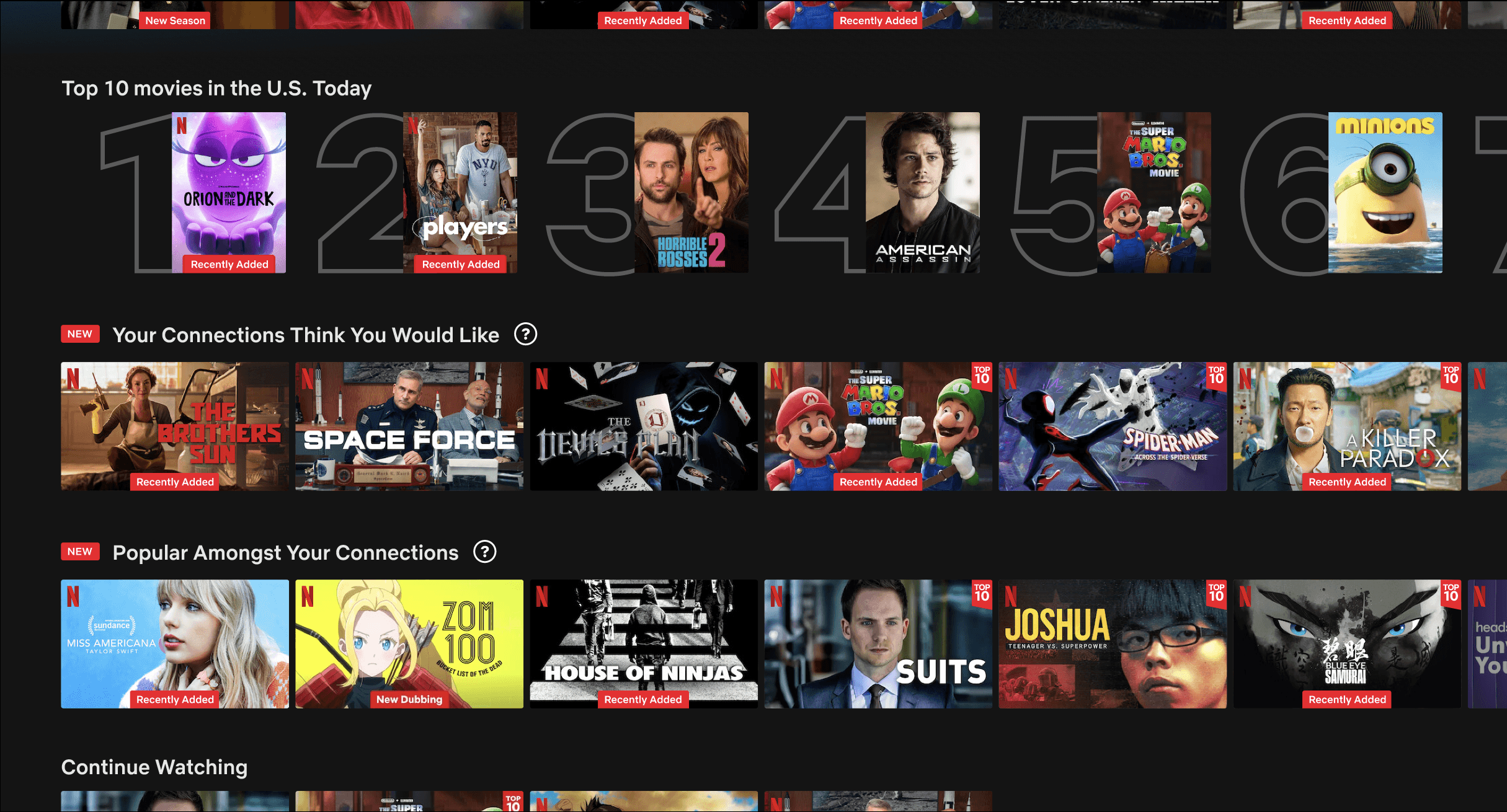
New categories
New categories
New categories presented in same format as existing categories
New categories presented in same format as existing categories
4.
4.
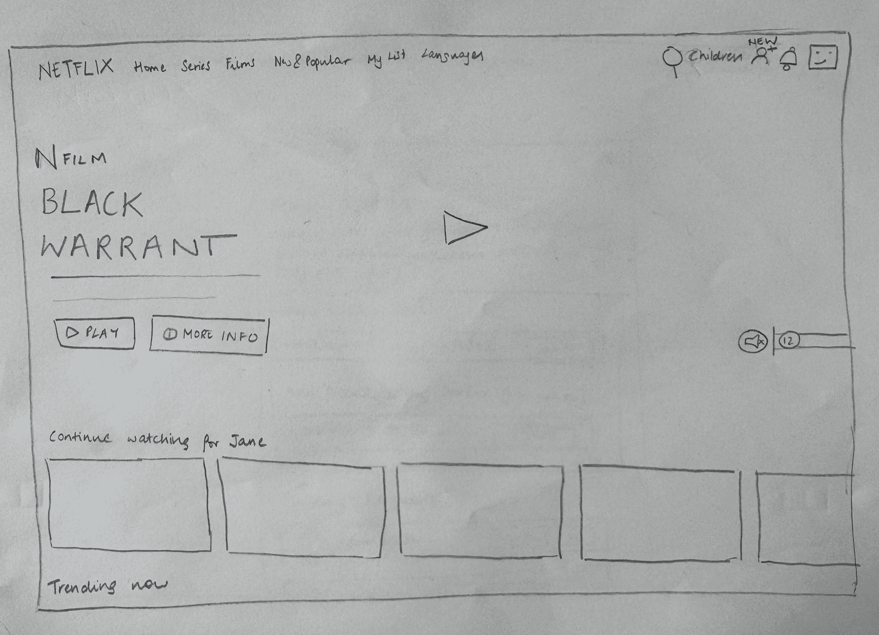
Title description page
Title description page

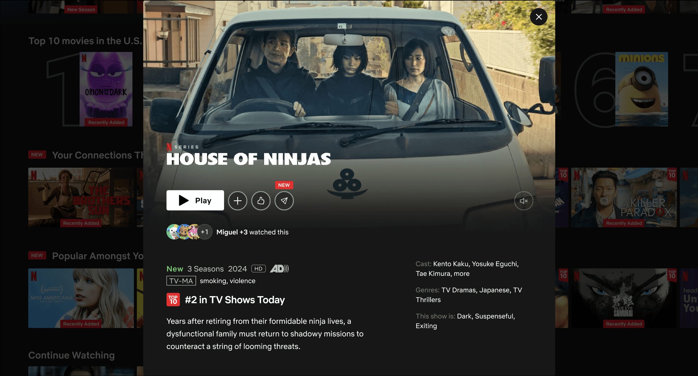
Friend viewing activity and recommend title action added to existing touchpoints
Friend viewing activity and recommend title action added to existing touchpoints
5.
5.
Title end screen
Title end screen

Recommendation prompt provided at the end of a title - similar to current like/dislike feature
Recommendation prompt provided at the end of a title - similar to current like/dislike feature
6.
6.
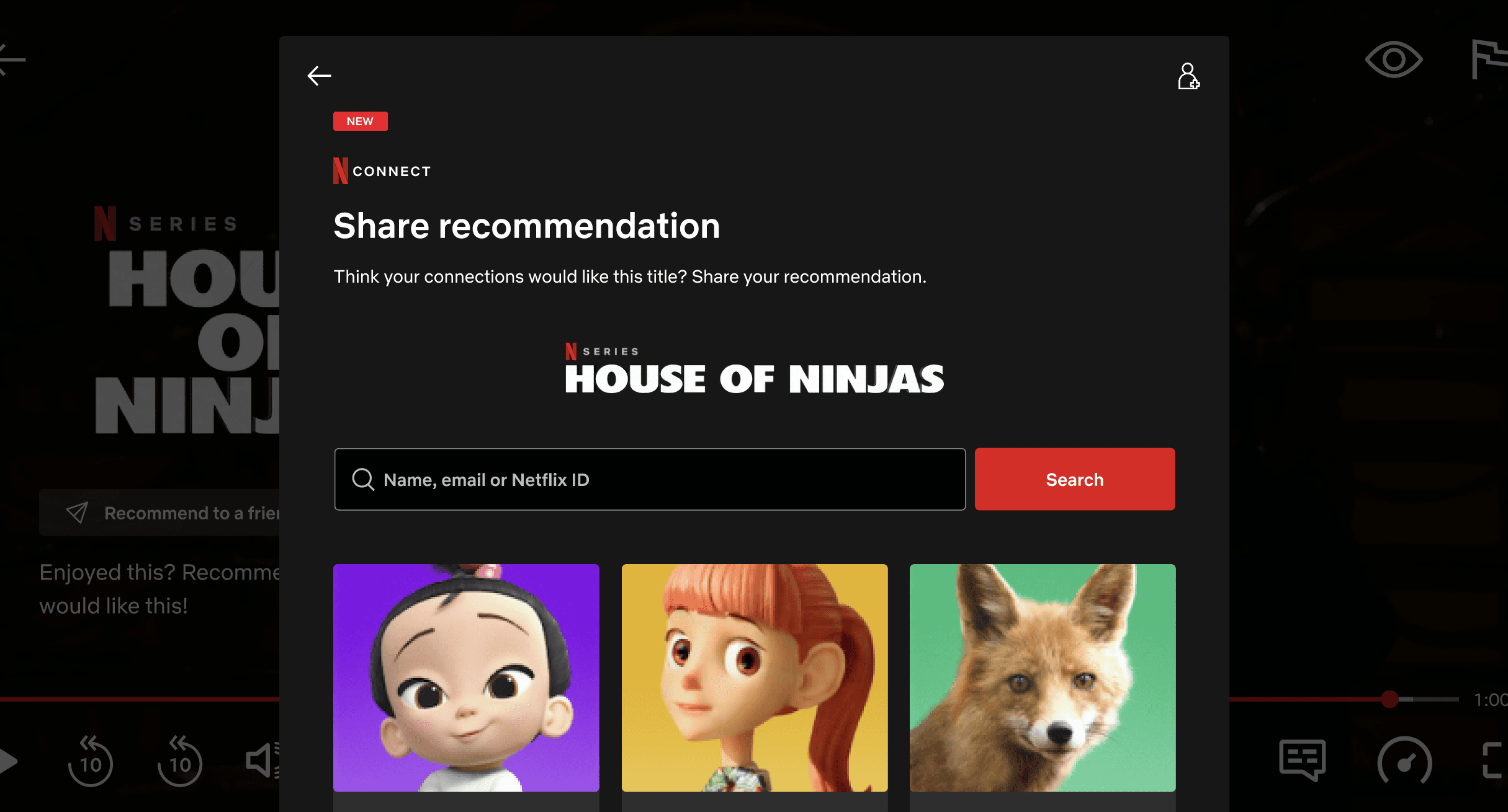
Recommendation modal
Recommendation modal

Simple one-click recommendation system - similar format as adding friends
Simple one-click recommendation system - similar format as adding friends
DECISIONS AROUND DESIGN
DECISIONS AROUND DESIGN
Social discovery needed to feel seamless rather than separate - woven into existing user flows so social elements felt like they had always been there.
Social discovery needed to feel seamless rather than separate - woven into existing user flows so social elements felt like they had always been there.
Social discovery needed to feel seamless rather than separate - woven into existing user flows so social elements felt like they had always been there.
TESTING AND ITERATING
TESTING AND ITERATING
Making the final cut
Making the final cut
I conducted an unmoderated usability test via Maze with 11 regular Netflix users. The research revealed genuine enthusiasm for this as a Netflix feature.
I conducted an unmoderated usability test via Maze with 11 regular Netflix users. The research revealed genuine enthusiasm for this as a Netflix feature.

.
/
.
/
OVERALL SATISFACTION
OVERALL SATISFACTION
Average user rating of the concept and feature experience
Average user rating of the concept and feature experience

.
/
.
/
EASE OF USE
EASE OF USE
Average usability score across all tested user flows and tasks
Average usability score across all tested user flows and tasks

/
/
.
/
/
.
IMPROVES DISCOVERY
IMPROVES DISCOVERY
How likely users think this feature would make content discovery easier
How likely users think this feature would make content discovery easier

%
%
FEATURE ADOPTION RATE
FEATURE ADOPTION RATE
11/11 users expressed interest in using this feature if it existed
11/11 users expressed interest in using this feature if it existed
However, a few tweaks were needed to make users feel confident in using these new features.
However, a few tweaks were needed to make users feel confident in using these new features.
1.
1.
Users hit a dead end when trying to recommend content—if they had no friends added or wanted to share with someone they weren't connected with, the flow didn't guide them on what to do next.
Users hit a dead end when trying to recommend content—if they had no friends added or wanted to share with someone they weren't connected with, the flow didn't guide them on what to do next.
A
A
B
B


A
A
Added a clear pathway for users with no connections, prompting them to "Start Connecting" before they can share recommendations.
Added a clear pathway for users with no connections, prompting them to "Start Connecting" before they can share recommendations.
B
B
When searching for someone not in their network, users are directed towards the "Start Connecting" page to add them as a friend
When searching for someone not in their network, users are directed towards the "Start Connecting" page to add them as a friend
2.
2.
Users wanted granular privacy control over specific content they were watching; however, these privacy settings were buried in menus, and users would have to navigate away from their current screen to access these.
Users wanted granular privacy control over specific content they were watching; however, these privacy settings were buried in menus, and users would have to navigate away from their current screen to access these.
A
A
B
B


A
A
Added a privacy notification that appears during viewing, informing users that "Your connections can see your viewing activity," with an option to turn on privacy mode
Added a privacy notification that appears during viewing, informing users that "Your connections can see your viewing activity," with an option to turn on privacy mode
B
B
Easy toggle to turn on/off privacy mode in case users changed their mind
Easy toggle to turn on/off privacy mode in case users changed their mind
3.
3.
For privacy reasons, users wanted the option to completely opt out of social features. Originally, they could only do this individually in the settings.
For privacy reasons, users wanted the option to completely opt out of social features. Originally, they could only do this individually in the settings.
A
A
B
B


A
A
Introduced master toggle on the main Netflix Connect modal that disables all social features. Provides easy access instead of having to do this manually in settings
Introduced master toggle on the main Netflix Connect modal that disables all social features. Provides easy access instead of having to do this manually in settings
B
B
When turned off—users can't find or be found by others, and can't share or see friend activity until they choose to re-enable Netflix Connect
When turned off—users can't find or be found by others, and can't share or see friend activity until they choose to re-enable Netflix Connect
4.
4.
Users wanted assurance that shown content reflected genuine engagement, not abandoned or incomplete viewing.
Users wanted assurance that shown content reflected genuine engagement, not abandoned or incomplete viewing.
A
A
B
B


A
A
Added a hover tooltip for the "Your Connections Think You Would Like" category that provides transparency about the source of recommendations.
Added a hover tooltip for the "Your Connections Think You Would Like" category that provides transparency about the source of recommendations.
B
B
Introduced clear criteria messaging for the "Popular Amongst Your Connections" category, so users understand recommendations come from substantial friend engagement rather than casual viewing.
Introduced clear criteria messaging for the "Popular Amongst Your Connections" category, so users understand recommendations come from substantial friend engagement rather than casual viewing.
WHAT TESTING SAID
WHAT TESTING SAID
It was important for users to feel empowered rather than exposed—every iteration focused on giving them more control and transparency.
It was important for users to feel empowered rather than exposed—every iteration focused on giving them more control and transparency.
It was important for users to feel empowered rather than exposed—every iteration focused on giving them more control and transparency.
REFLECTING ON THE PROCESS
REFLECTING ON THE PROCESS
Filling in the plot holes
Filling in the plot holes
Netflix Connect doesn't just solve the problem of content discovery, it transforms how users relate to and engage with the platform.
Netflix Connect doesn't just solve the problem of content discovery, it transforms how users relate to and engage with the platform.

1.
Taps into existing behaviours that users are already familiar with
Taps into existing behaviours that users are already familiar with
I mostly get recommendations from my friends. Then I go check it out and 80% of the time what they suggested is good
I mostly get recommendations from my friends. Then I go check it out and 80% of the time what they suggested is good
I mostly get recommendations from my friends. Then I go check it out and 80% of the time what they suggested is good
2.
Transforms content discovery into a trusted and efficient process
Transforms content discovery into a trusted and efficient process
I think it was a really good feature and would definitely make it easier to choose things to watch and get recommendations.
I think it was a really good feature and would definitely make it easier to choose things to watch and get recommendations.
I think it was a really good feature and would definitely make it easier to choose things to watch and get recommendations.
3.
Creates a foundation for future engagement through added features
Creates a foundation for future engagement through added features
Adding a watch party feature to this could be great to keep people connected especially with long-distance friends and family
Adding a watch party feature to this could be great to keep people connected especially with long-distance friends and family
Adding a watch party feature to this could be great to keep people connected especially with long-distance friends and family
That's a wrap
That's a wrap
This project gave me some really interesting insights about design. Here are three key things that stuck with me:
This project gave me some really interesting insights about design. Here are three key things that stuck with me:
The ideation process is never straightforward
The ideation process is never straightforward
Exploring multiple ideas (including some not-so-great ones) was essential to finding what actually worked.
Exploring multiple ideas (including some not-so-great ones) was essential to finding what actually worked.
Exploring multiple ideas (including some not-so-great ones) was essential to finding what actually worked.
Design constraints can act as creative catalysts
Design constraints can act as creative catalysts
Using Netflix's existing design system forced better integration, creating features that felt native to the platform.
It feels well organised, I like that I can find things to donate to this way. It's all in one place so I can be more intentional.
Using Netflix's existing design system forced better integration, creating features that felt native to the platform.
Users may already have the answers to a problem
Users may already have the answers to a problem
In the end, the most effective solution enabled existing user behaviours rather than inventing new ones.
In the end, the most effective solution enabled existing user behaviours rather than inventing new ones.
In the end, the most effective solution enabled existing user behaviours rather than inventing new ones.

IF I HAD TO DO IT AGAIN…
IF I HAD TO DO IT AGAIN…
IF I HAD TO DO IT AGAIN…
As one of my first major projects, I didn't fully understand the power of components and variants in Figma, which could have made the design process significantly more efficient and consistent. I also chose unmoderated testing for this study, but in hindsight, moderated sessions may have been better suited for such a radical feature addition. Some participants got fixated on how to use the testing platform rather than focusing on the design itself, making it difficult to distinguish between genuine usability issues and platform confusion. Moderated testing could have allowed me to clarify confusion in real-time and gather more detailed insights about user reactions to this conceptual shift.
As one of my first major projects, I didn't fully understand the power of components and variants in Figma, which could have made the design process significantly more efficient and consistent. I also chose unmoderated testing for this study, but in hindsight, moderated sessions may have been better suited for such a radical feature addition. Some participants got fixated on how to use the testing platform rather than focusing on the design itself, making it difficult to distinguish between genuine usability issues and platform confusion. Moderated testing could have allowed me to clarify confusion in real-time and gather more detailed insights about user reactions to this conceptual shift.