Small Drops
Small Drops
Bridging the generational gap in charitable giving in India
Bridging the generational gap in charitable giving in India
Timeline
Timeline
7 weeks
7 weeks
Industry
Industry
Non-profit
Non-profit
Platform
Platform
Mobile application
Mobile application
Services
Services
User research
Product strategy
UI design
Brand and visual identity
Usability testing
User research
Product strategy
UI design
Brand and visual identity
Usability testing
Timeline
7 weeks
Industry
Non-profit
Platform
Mobile application
Services
User research
Product strategy
UI design
Brand and visual identity
Usability testing
The problem
The problem
The problem
Like many people I'd spoken to, I wanted to donate and make a real difference, but had no idea what was actually useful or how to create genuine impact. So I just... didn't donate at all.
This problem is part of a larger global crisis in charitable giving where potential donors feel stuck—wanting to help but lacking the tools, transparency, and guidance to feel confident their contributions will create meaningful change.
The solution
The solution
The solution
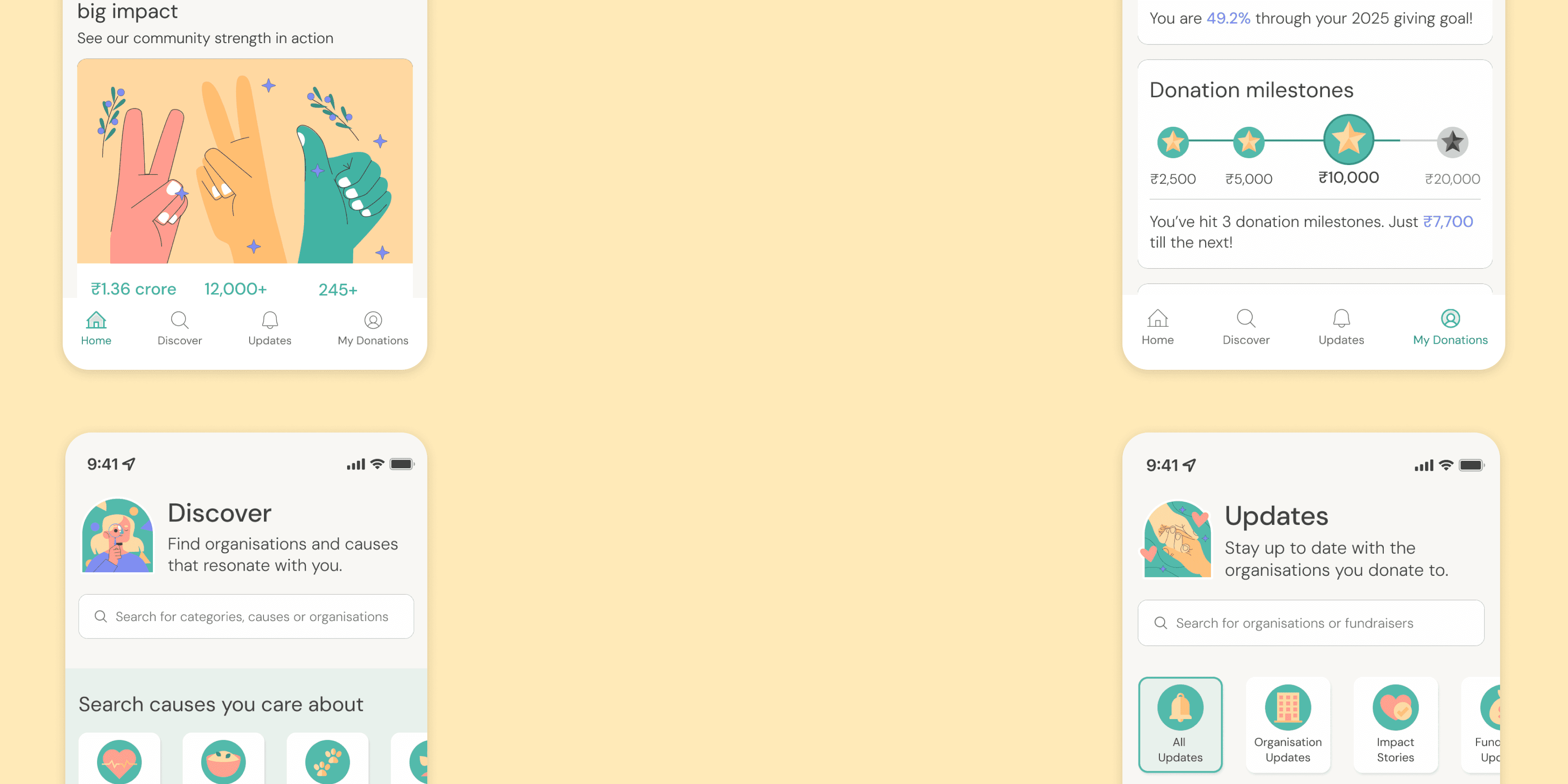
A mobile platform that makes charitable giving as intuitive as scrolling on social media, while providing the transparency and impact tracking that donors desperately need.
Small Drops connects younger, socially-conscious individuals with verified charitable organizations through personalized discovery, bite-sized impact updates, and seamless donation experiences.
MY INITIAL HYPOTHESIS
MY INITIAL HYPOTHESIS
MY INITIAL HYPOTHESIS
People aren't donating because they can't track their impact. If I can solve the 'what happens after I donate?' question, I can unlock an audience of donors who are blocked by this uncertainty.
People aren't donating because they can't track their impact. If I can solve the 'what happens after I donate?' question, I can unlock an audience of donors who are blocked by this uncertainty.
People aren't donating because they can't track their impact. If I can solve the 'what happens after I donate?' question, I can unlock an audience of donors who are blocked by this uncertainty.

THE 5-MINUTE VERSION
THE 5-MINUTE VERSION
THE 5-MINUTE VERSION
DISCOVERING THE WHO, WHAT, WHY
DISCOVERING THE WHO, WHAT, WHY
DISCOVERING THE WHO, WHAT, WHY
Before diving into user research, I analyzed charitable platforms both in India and internationally to understand how they approached donor engagement:
Before diving into user research, I analyzed charitable platforms both in India and internationally to understand how they approached donor engagement:
Transparency-focused platforms
Transparency-focused platforms
e.g. Charity Navigator
e.g. Charity Navigator
✓✓ Trust and verification
✓✓ Broad cause coverage
✗✗ Emotional storytelling
✗✗ Engaging user experience
✓✓ Trust and verification
✓✓ Broad cause coverage
✗✗ Emotional storytelling
✗✗ Engaging user experience
Engagement-focused platforms
Engagement-focused platforms
e.g. Share The Meal
e.g. Share The Meal
✓ Trust and verification
✗✗ Broad cause coverage
✓ Emotional storytelling
✓✓ Engaging user experience
✓ Trust and verification
✗✗ Broad cause
coverage
✓ Emotional storytelling
✓✓ Engaging user experience
Individual fundraiser platforms
Fundraiser platforms
e.g. Ketto, GoFundMe
e.g. Ketto, GoFundMe
✗✗ Trust and verification
✓✓ Broad cause coverage
✓✓ Emotional storytelling
✗ Engaging user experience
✗✗ Trust and verification
✓✓ Broad cause coverage
✓✓ Emotional storytelling
✗ Engaging user experience
THE OPPORTUNITY
THE OPPORTUNITY
A solution that bridges these three worlds: emotional storytelling, broad cause coverage, and organizational legitimacy—no platform does all three.
A solution that bridges these three worlds: emotional storytelling, broad cause coverage, and organizational legitimacy—no platform does all three.
Understanding the landscape
Understanding the landscape
The AHA moment
The AHA moment
I interviewed 9 participants - 6 donors and 3 non-profits - to understand both sides of charitable giving. After interviewing my first participant over 40, a pattern emerged that changed everything. I immediately pivoted my research strategy, intentionally seeking out additional older donors for comparison.
I interviewed 9 participants - 6 donors and 3 non-profits - to understand both sides of charitable giving. After interviewing my first participant over 40, a pattern emerged that changed everything. I immediately pivoted my research strategy, intentionally seeking out additional older donors for comparison.
Need seamless digital donation methods
Want bite-sized visual updates
Prefer long-term, structured philanthropy
Foster personal connections, in-person visits
Want formal impact reports and documents
Use traditional donation methods (cash, in-kind)
Emotionally-led, discover causes through social media
Time-constrained but more trusting
Need seamless digital donation methods
Want concise, digestible and visual updates
older
donors
younger
donors
Need seamless digital donation methods
Want bite-sized visual updates
Prefer long-term, structured philanthropy
Foster personal connections, in-person visits
Want formal impact reports and documents
Use traditional donation methods (cash, in-kind)
Emotionally-led, discover causes through social media
Time-constrained but more trusting
Need seamless digital donation methods
Want concise, digestible and visual updates
older
donors
younger
donors
Till now, non-profits had built their entire engagement strategy around older donors, creating a fundamental misalignment with younger donors' expectations. It wasn’t just about tracking impact - younger donors didn't even know where to start. They didn't know what causes to donate to, how to evaluate organizations, or even how to begin.
Till now, non-profits had built their entire engagement strategy around older donors, creating a fundamental misalignment with younger donors' expectations. It wasn’t just about tracking impact - younger donors didn't even know where to start. They didn't know what causes to donate to, how to evaluate organizations, or even how to begin.
WHAT I DISCOVERED
WHAT I DISCOVERED
WHAT I DISCOVERED
The charitable giving "problem" might actually be a generational design problem— built for one generation's preferences while inadvertently missing another's entirely.
The charitable giving "problem" might actually be a generational design problem— built for one generation's preferences while inadvertently missing another's entirely.
The charitable giving "problem" might actually be a generational design problem— built for one generation's preferences while inadvertently missing another's entirely.
DEFINING THE PROBLEM
DEFINING THE PROBLEM
DEFINING THE PROBLEM
Reframing the problem
Reframing the problem
The research revealed my true target: tech-savvy, socially-conscious individuals aged 18-40 who wanted to make meaningful charitable contributions but lacked time for extensive research.
The research revealed my true target: tech-savvy, socially-conscious individuals aged 18-40 who wanted to make meaningful charitable contributions but lacked time for extensive research.
Primary persona


I usually find stuff to donate to on social media…i have to feel emotionally connected to it
I usually find stuff to donate to on social media…i have to feel emotionally connected to it
Social
Social
Tech-savvy
Tech-savvy
Empathetic
Empathetic
Efficient
Efficient
Decisive
Decisive
Wants quick, bite sized information on the impact of their donations
Wants quick, bite sized information on the impact of their donations

How do i find donation opportunities
easily?
Doesn't have time to research and verify organisations
Doesn't have time to research and verify organisations
Likes donating digitally
Likes donating digitally
How do i find donation opportunities
easily?
How do i find donation opportunities
easily?
DEFINING THE PROBLEM
DEFINING THE PROBLEM
How might we connect younger, socially conscious individuals with causes they value while satisfying their needs for trust, meaningful impact, and efficiency?
How might we connect younger, socially conscious individuals with causes they value while satisfying their needs for trust, meaningful impact, and efficiency?
How might we connect younger, socially conscious individuals with causes they value while satisfying their needs for trust, meaningful impact, and efficiency?
IDEATING THE SOLUTION
IDEATING THE SOLUTION
IDEATING THE SOLUTION
Design directions born from insight
Design directions born from insight
Four core themes emerged directly from the research to guide the development of the core features:
Four core themes emerged directly from the research to guide the development of the core features:
1.
1.
Users were emotionally-driven to donate but had no consistent way of finding organisations.
Users were emotionally-driven to donate but had no consistent way of finding organisations.
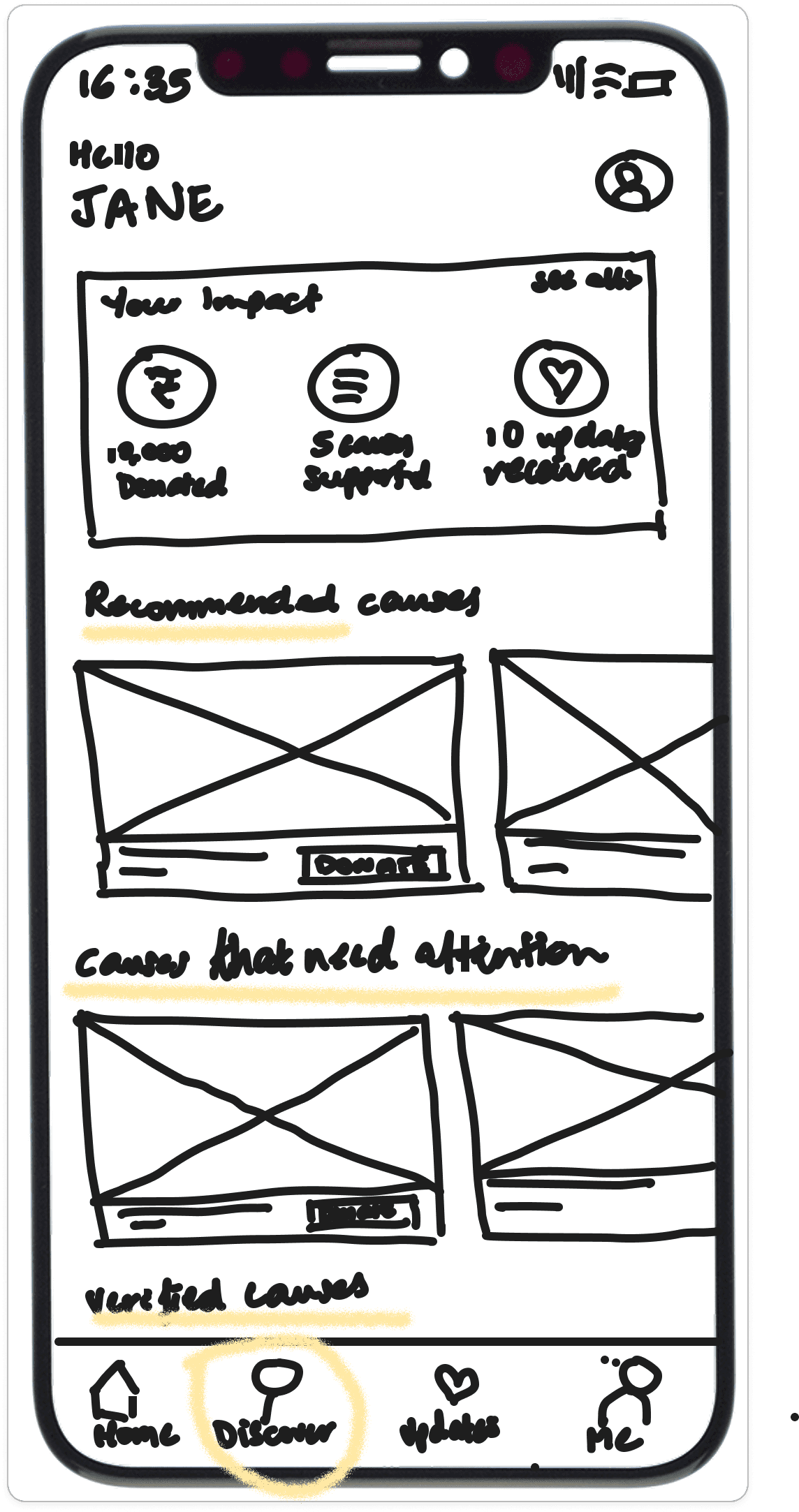
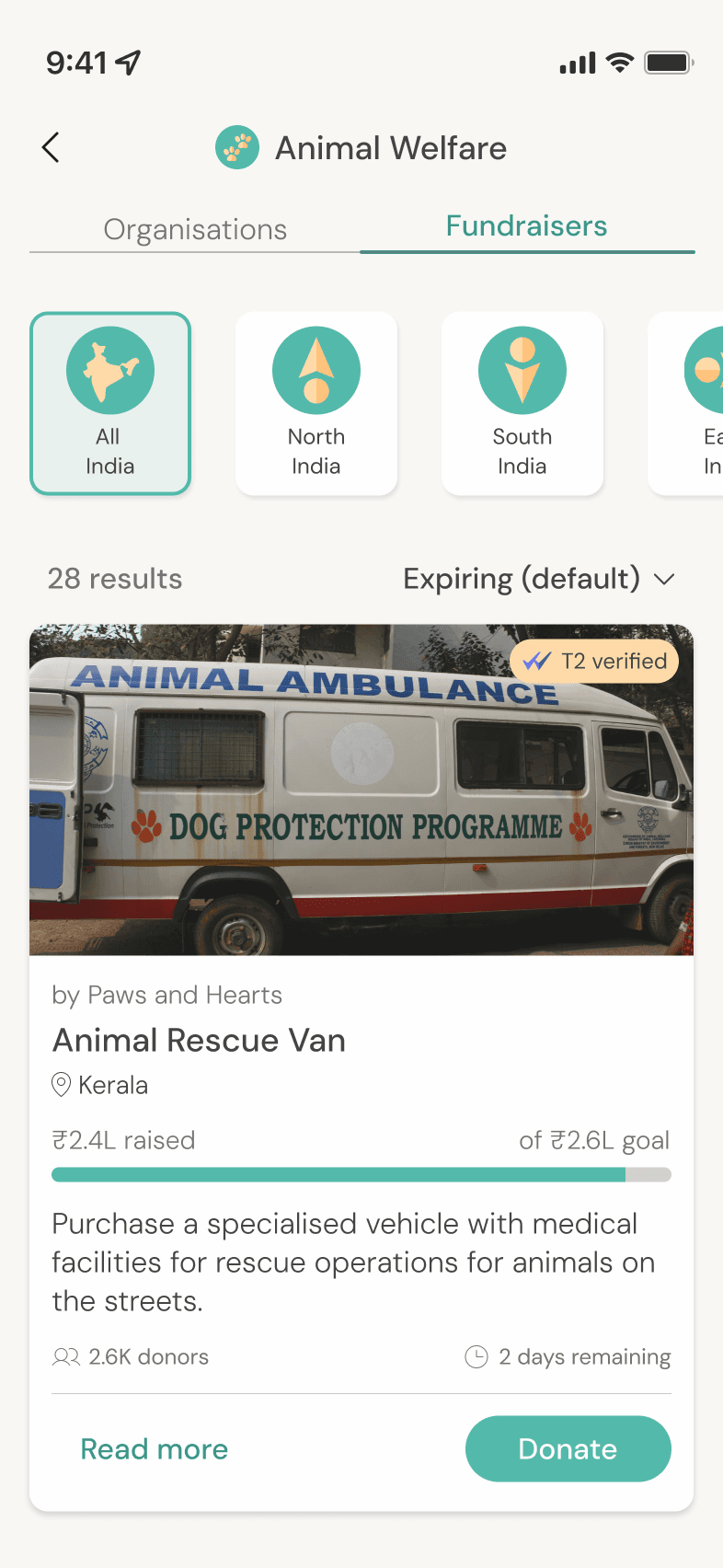
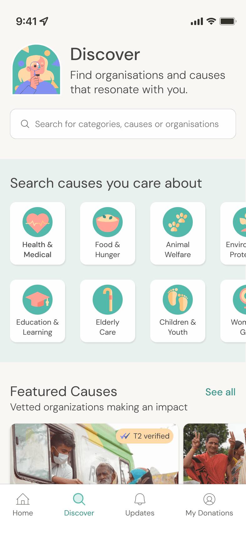
Personalized discovery of non-profits based on causes (e.g. hunger, education, animals etc.)
Personalized discovery of non-profits based on causes (e.g. hunger, education, animals etc.)
2.
2.
Younger donors were often short on time to do thorough research on organisations.
Younger donors were often short on time to do thorough research on organisations.
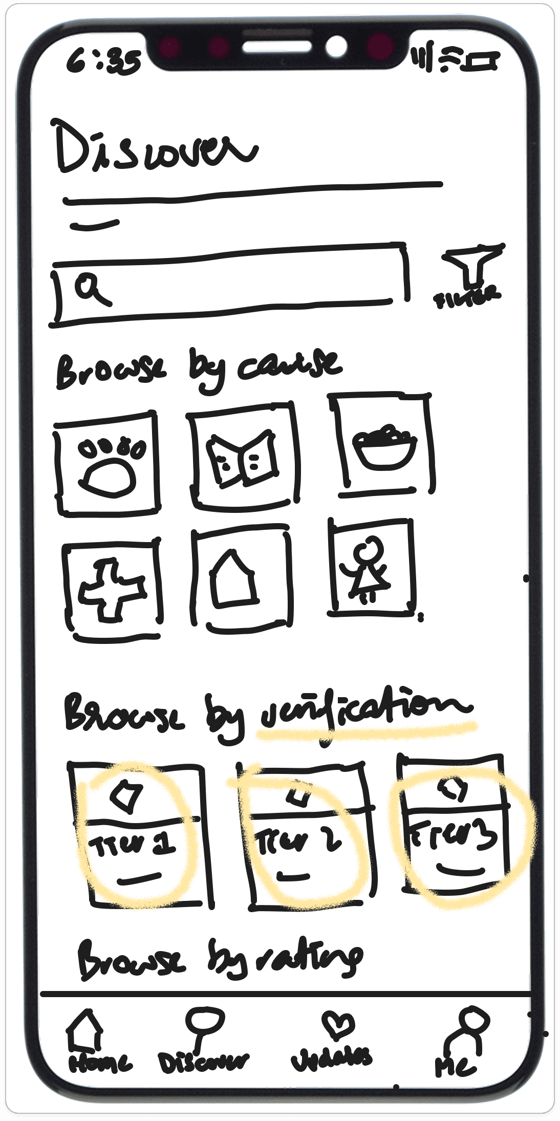
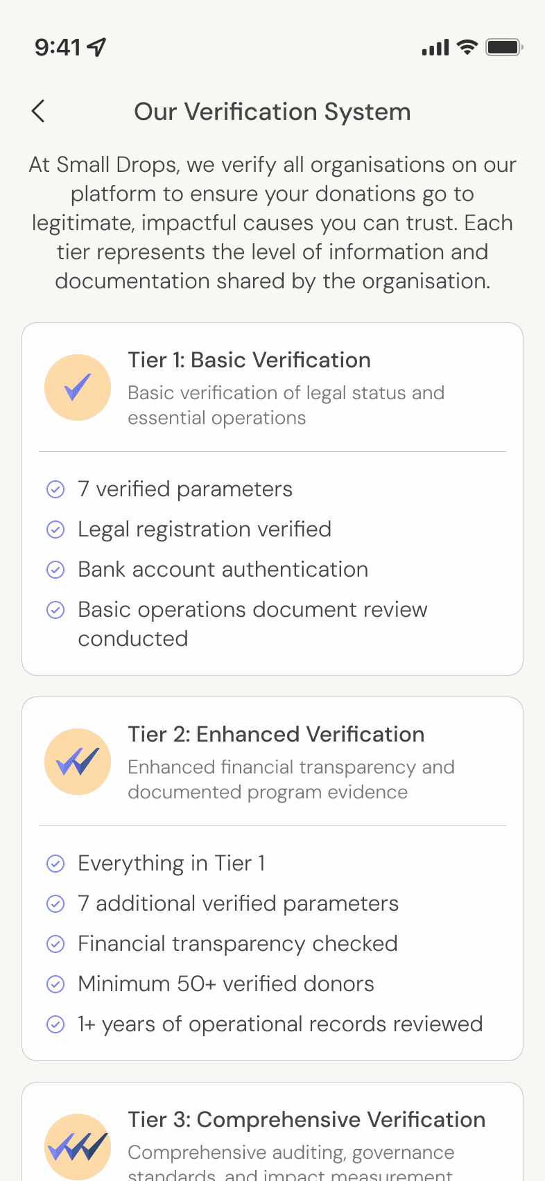
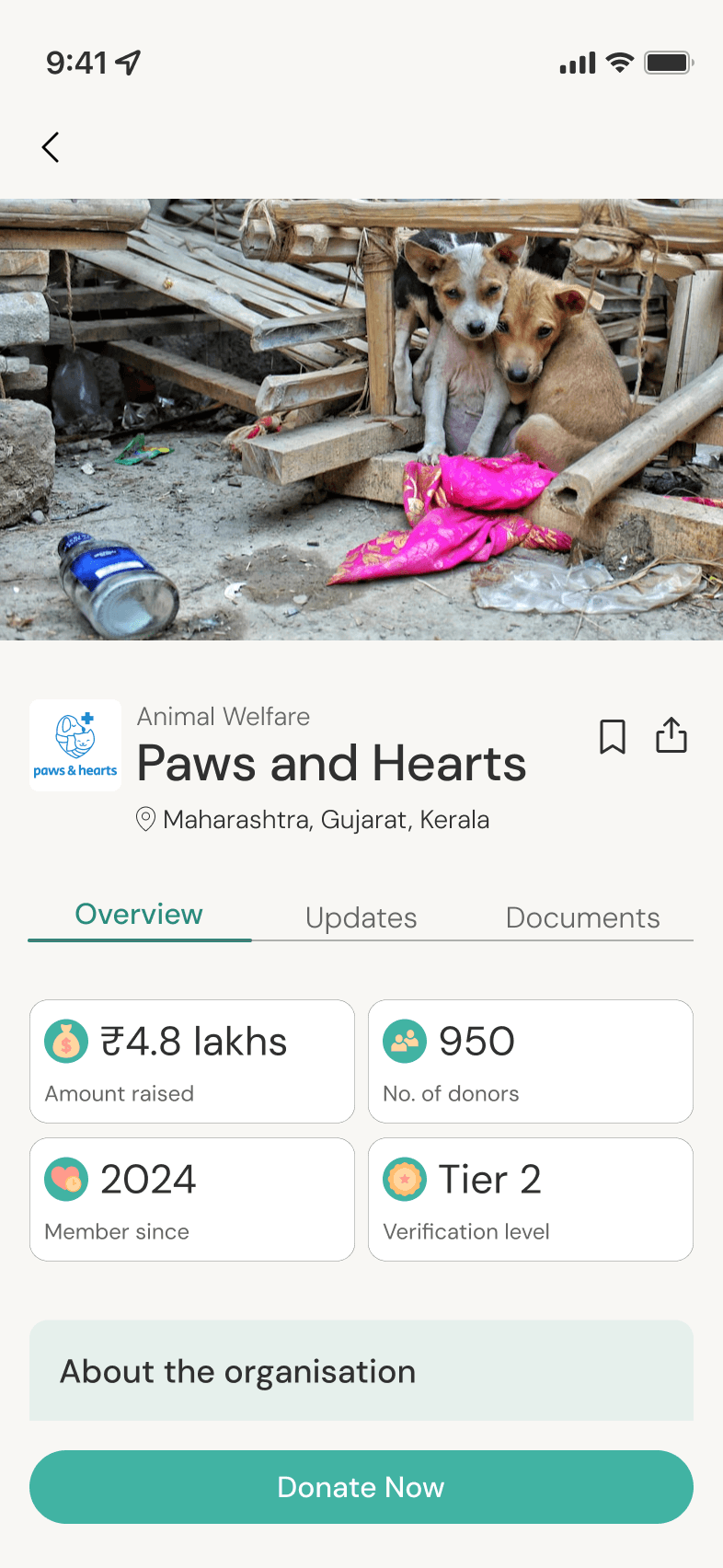
Simple tier-based verification system that immediately indicates organisation legitimacy
Simple tier-based verification system that immediately indicates organisation legitimacy
3.
3.
Users wanted to see the human impact of their donations through visual storytelling.
Users wanted to see the human impact of their donations through visual storytelling.
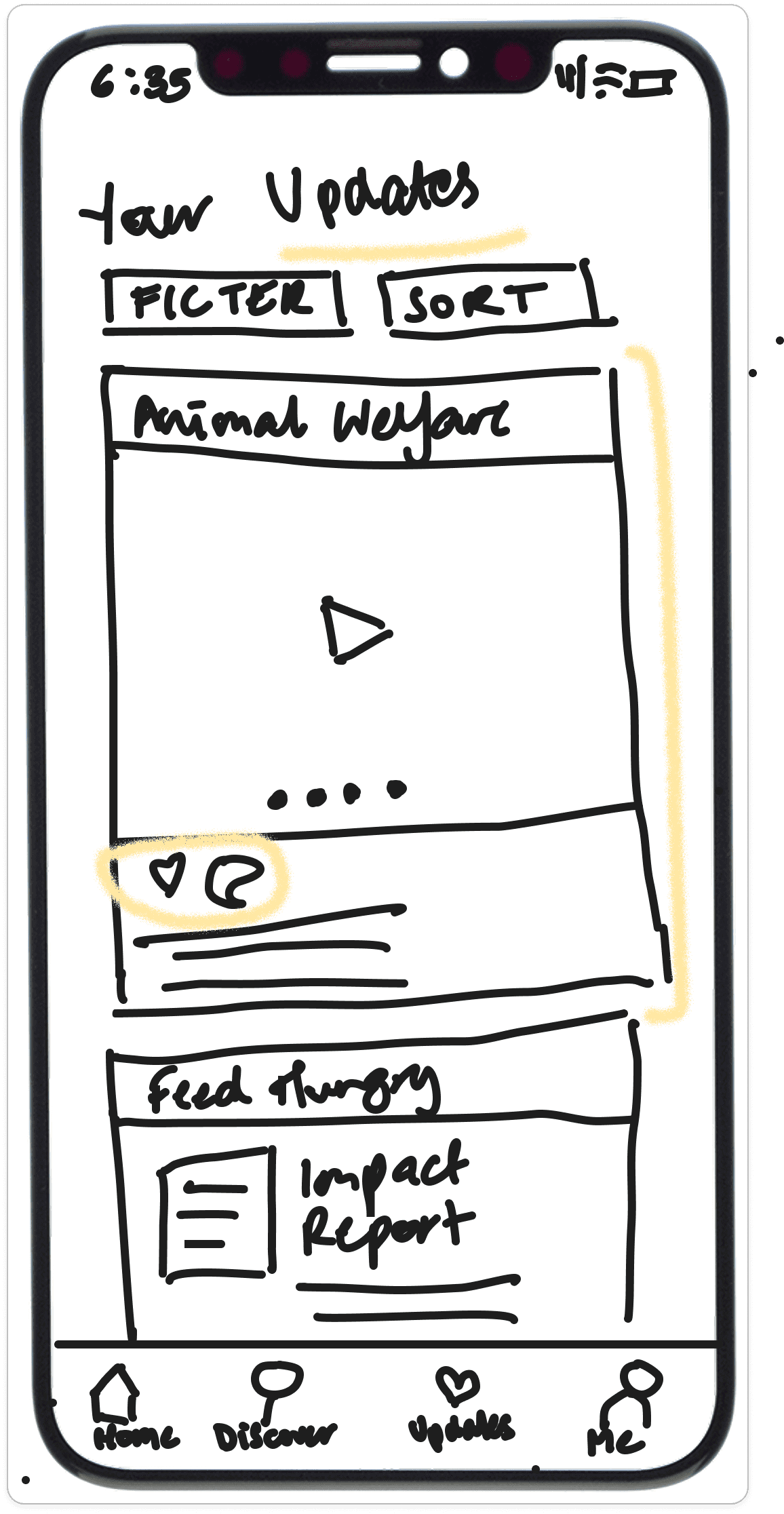
Bite-sized, visual impact updates that resemble a social media feed
Bite-sized, visual impact updates that resemble a social media feed
4.
4.
Users wanted to be able to make their donations seamlessly and digitally.
Users wanted to be able to make their donations seamlessly and digitally.
+
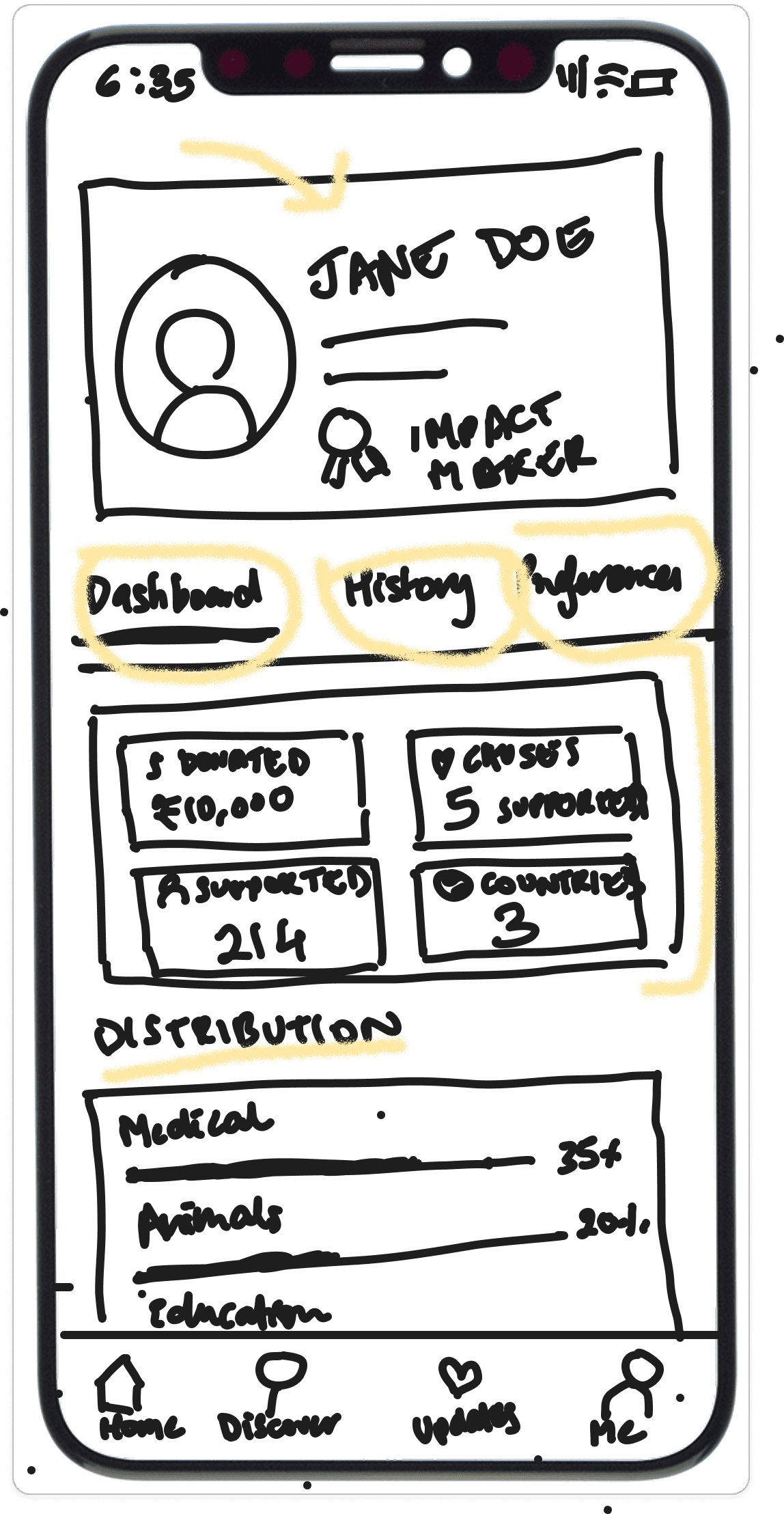
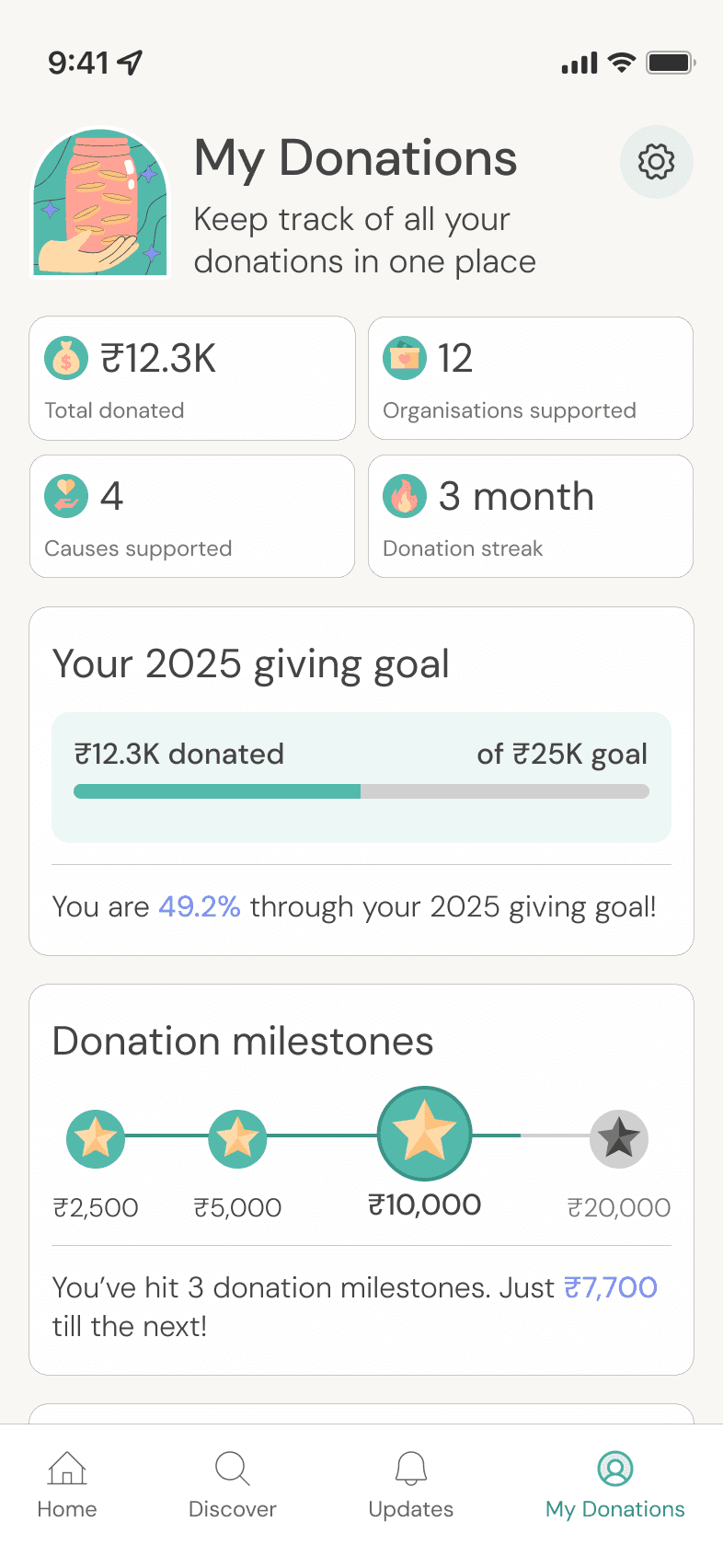
Dashboard to track impact over time
Dashboard to track impact over time
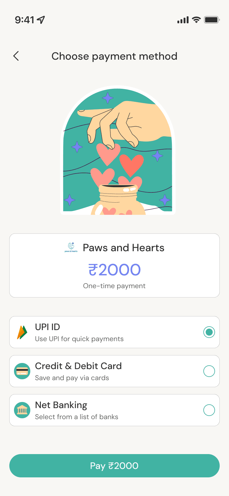
Digital donation portal with multiple payment options
Digital donation portal with multiple payment options
With the core features defined, I mapped out user flows to understand how younger donors would move through the discovery, evaluation, and donation process. The flows themselves seemed simple, but the complexity was hidden in navigating questions like:
With the core features defined, I mapped out user flows to understand how younger donors would move through the discovery, evaluation, and donation process. The flows themselves seemed simple, but the complexity was hidden in navigating questions like:

How do I personalise discovery without overwhelming users with choice?
How can I deliver impact information that is engaging yet feels legitimate?
How can I present the verification system in a digestible yet trustworthy way?
How do I personalise discovery without overwhelming users with choice?
How can I deliver impact information that is engaging yet feels legitimate?
How can I present the verification system in a digestible yet trustworthy way?
How can I deliver impact information that is engaging yet feels legitimate?
How can I present the verification system in a digestible yet trustworthy way?
How do I personalise discovery without overwhelming users with choice?
THE IDEATING PROCESS
THE IDEATING PROCESS
Each feature directly addressed a specific barrier that kept younger donors from giving—from discovery paralysis to trust concerns to impact uncertainty.
Each feature directly addressed a specific barrier that kept younger donors from giving—from discovery paralysis to trust concerns to impact uncertainty.
Each feature directly addressed a specific barrier that kept younger donors from giving—from discovery paralysis to trust concerns to impact uncertainty.
DESIGNING THE EXPERIENCE
DESIGNING THE EXPERIENCE
DESIGNING THE EXPERIENCE
Finding the brand's voice
Finding the brand's voice
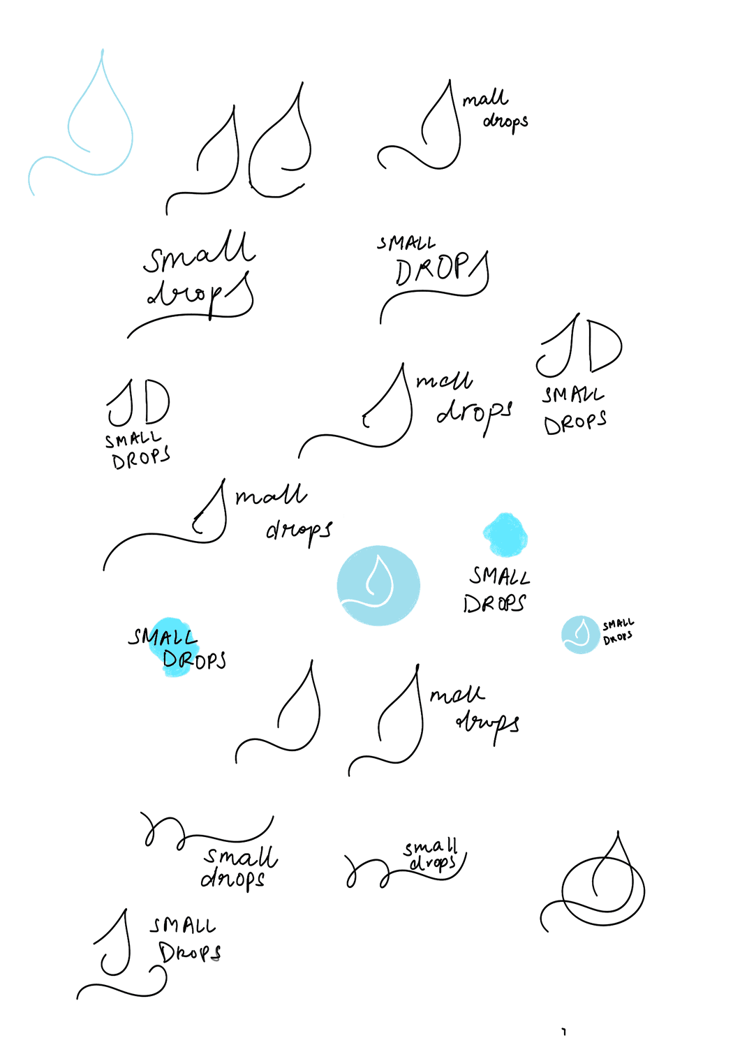
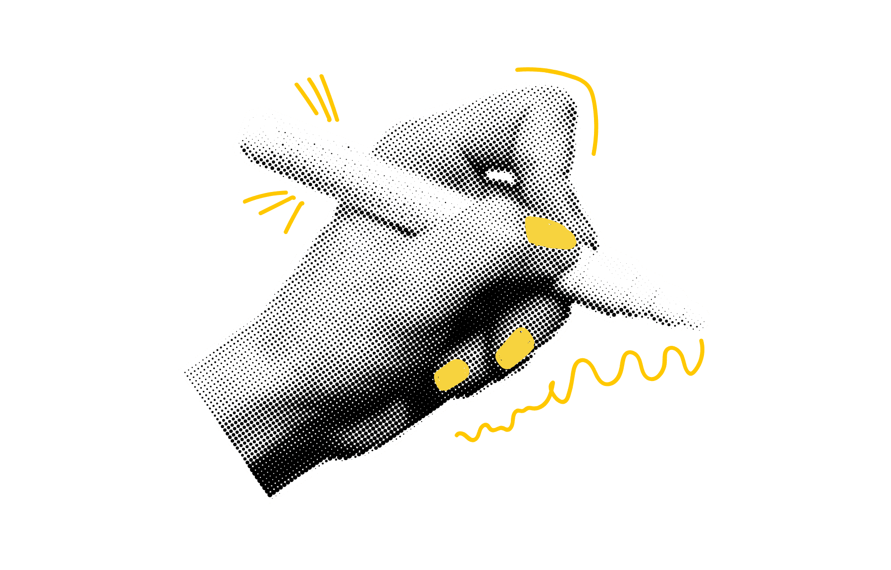
The name came from the timeless saying "small drops of water make the mighty ocean." The logo depicts an abstract drop extending into a line representing the ocean, flowing beyond the circular frame to symbolize how small contributions create infinite collective impact.
The name came from the timeless saying "small drops of water make the mighty ocean." The logo depicts an abstract drop extending into a line representing the ocean, flowing beyond the circular frame to symbolize how small contributions create infinite collective impact.
Too cutesy/pretty? Is it strong enough to cause people to want to donate their money?
Too cutesy/pretty? Is it strong enough to cause people to want to donate their money?


Feels more impactful and legitimate - balances warmth with credibility.
Feels more impactful and legitimate - balances warmth with credibility.
Extends beyond the frame
Extends beyond the frame
Drop-like symbol
Drop-like symbol
Resembles an 's'
Resembles an 's'
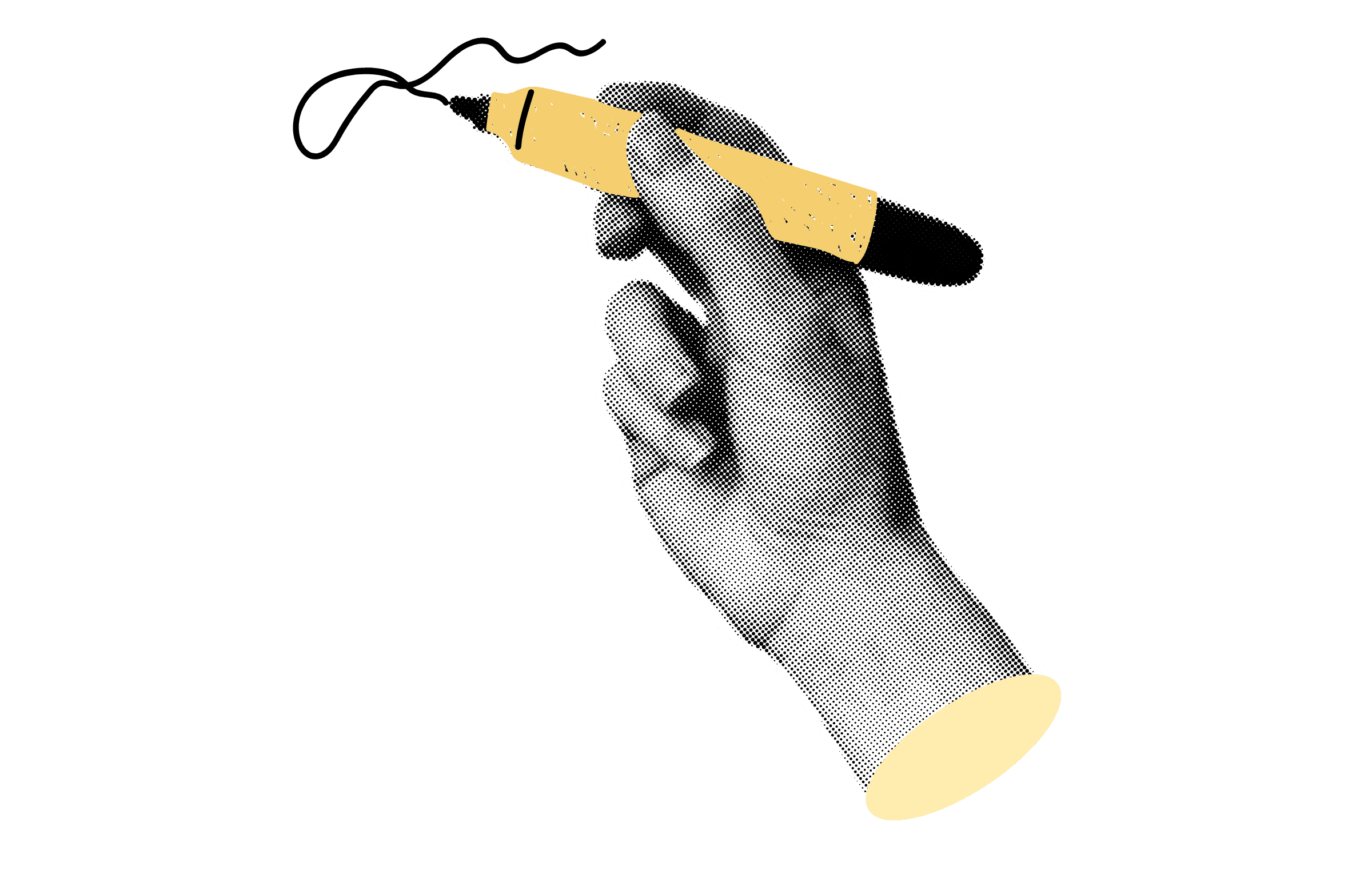
My initial instinct was to pursue a hand-drawn, pastel approach to communicate warmth and emotional connection. But as I progressed, the design felt too 'cutesy' to communicate the trust and legitimacy users needed when making financial decisions. The final design evolved to balance approachability with credibility.
My initial instinct was to pursue a hand-drawn, pastel approach to communicate warmth and emotional connection. But as I progressed, the design felt too 'cutesy' to communicate the trust and legitimacy users needed when making financial decisions. The final design evolved to balance approachability with credibility.
DECISIONS AROUND DESIGN
DECISIONS AROUND DESIGN
Visual design choices needed to go beyond aesthetics and serve functional requirements, especially in a product where money is involved.
Visual design choices needed to go beyond aesthetics and serve functional requirements, especially in a product where money is involved.
Visual design choices needed to go beyond aesthetics and serve functional requirements, especially in a product where money is involved.
TESTING AND ITERATING
TESTING AND ITERATING
TESTING AND ITERATING
Evaluating (and iterating) the solution
Evaluating (and iterating) the solution
Testing with 5 users aged 18-40 provided strong validation for both the concept and usability of the platform.
Testing with 5 users aged 18-40 provided strong validation for both the concept and usability of the platform.

%
%
TASK COMPLETION
TASK COMPLETION
5 of 5 participants successfully completed 5 of 5 tasks
5 of 5 participants successfully completed 5 of 5 tasks

/
.
/
.
EASE OF USE RATING
EASE OF USE RATING
Average score given by users for 'ease of use' across all 5 tasks
Average score given by users for 'ease of use' across all 5 tasks

/
/
COMPREHENSION SCORE
COMPREHENSION SCORE
'Ease of understanding' score by users for the tier verification system
'Ease of understanding' score by users for the tier verification system

%
%
APP ADOPTION RATE
APP ADOPTION RATE
4 of 5 users expressed definitive intent to use the platform if available
4 of 5 users expressed definitive intent to use the platform if available
Therefore, the parts of the application that needed work were not around usability or navigability, but rather how to enhance emotional connection, discovery, and comprehension of some of the features.
Therefore, the parts of the application that needed work were not around usability or navigability, but rather how to enhance emotional connection, discovery, and comprehension of some of the features.
1.
1.
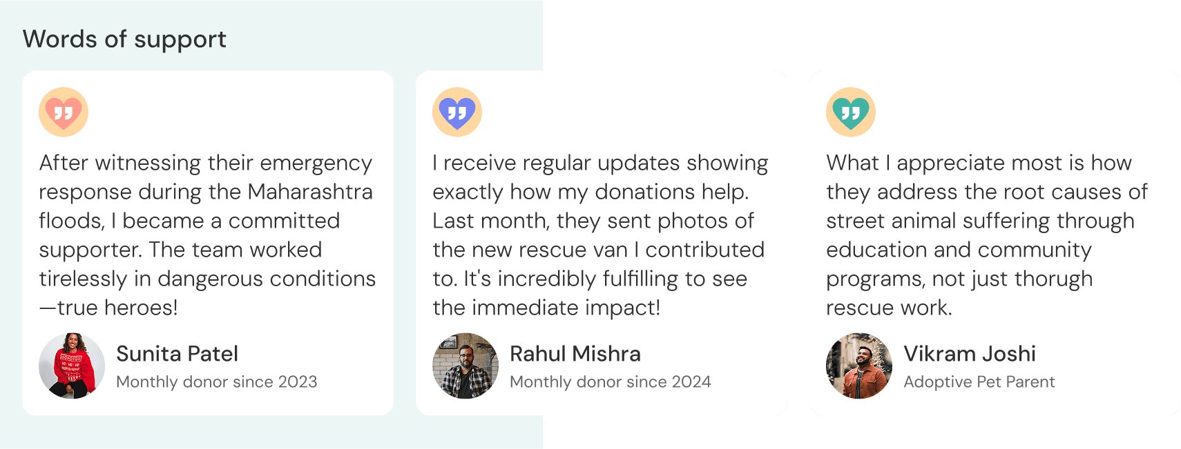
Organisation profiles felt formal and impersonal, missing the emotional connection users needed to engage fully.
Organisation profiles felt formal and impersonal, missing the emotional connection users needed to engage fully.
A
B
A
B
A
B
Donor testimonials
Donor testimonials
C
C
A
A
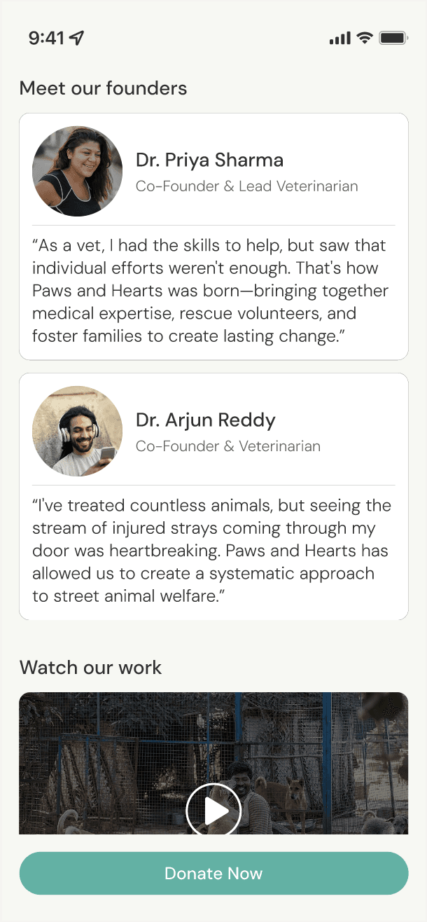
Added founder information to give a human face to the organisation
Added founder information to give a human face to the organisation
B
B
Included video content of the organisation's activities
Included video content of the organisation's activities
C
C
Added donor testimonials for social proof and human connection.
Added donor testimonials for social proof and human connection.
2.
2.
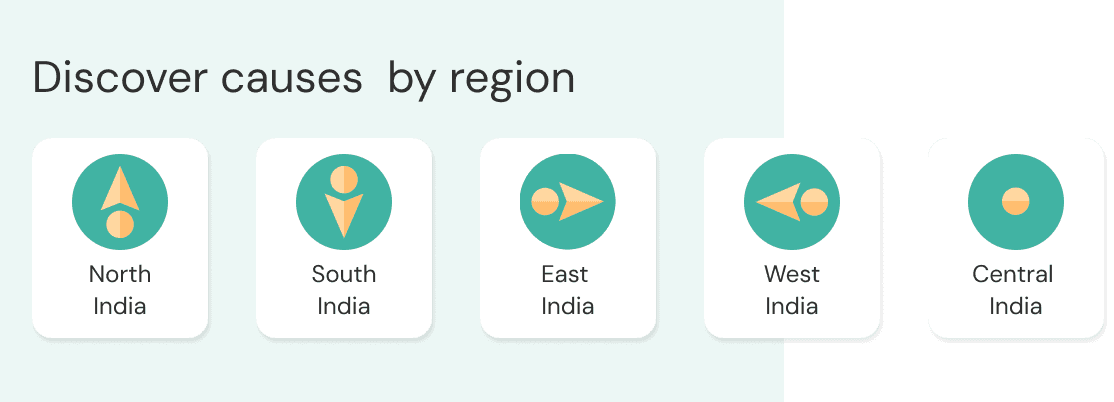
Users wanted the option to support causes in specific regions but could only filter by cause, limiting their ability to find organisations in their areas of interest.
Users wanted the option to support causes in specific regions but could only filter by cause, limiting their ability to find organisations in their areas of interest.
C
C
C
B
B
A
A
Added location filtering to the general search page for those who prioritised regional search over cause search
Added location filtering to the general search page for those who prioritised regional search over cause search
B
B
Included location information in organisation previews
Included location information in organisation previews
C
C
Added location filters WITHIN causes to enable more granular discovery
Added location filters WITHIN causes to enable more granular discovery
A
A
Regional filters
on 'Discover' page
Regional filters
on 'Discover' page
3.
3.
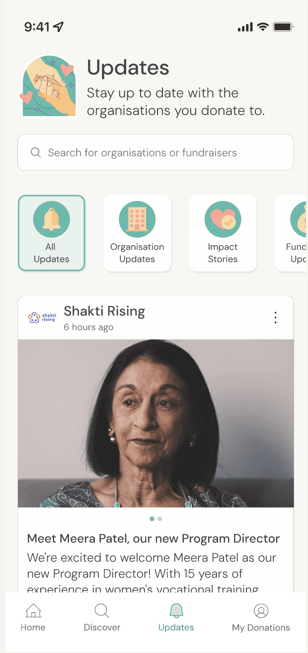
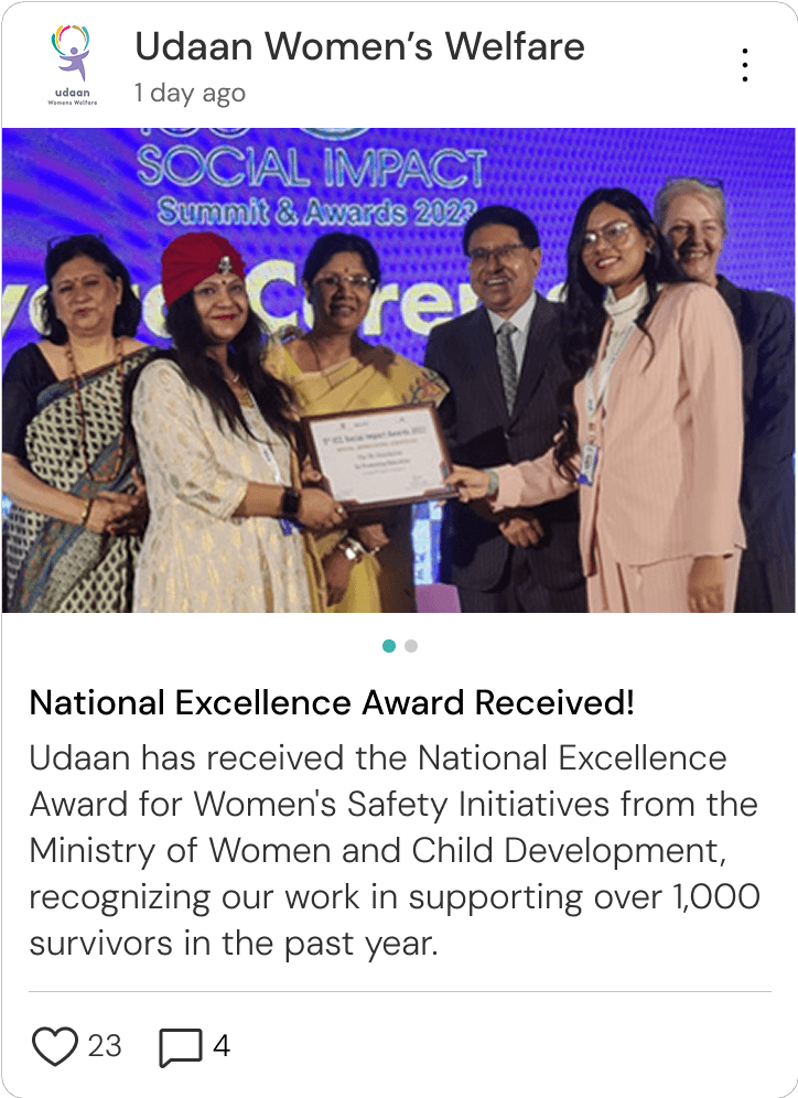
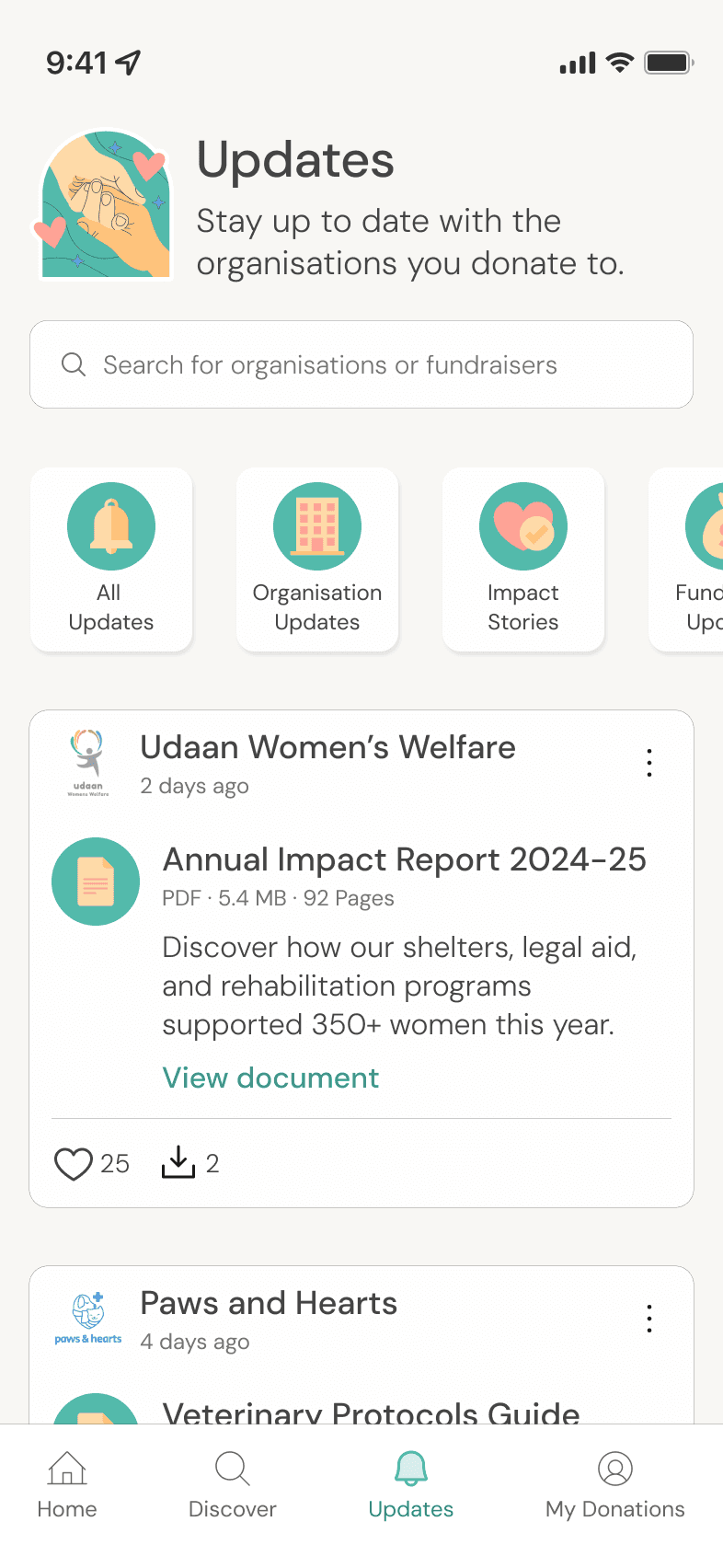
The difference between ‘General Updates’ and ‘Milestone Updates’ wasn't clear to users, causing confusion when browsing organisation activities.
The difference between ‘General Updates’ and ‘Milestone Updates’ wasn't clear to users, causing confusion when browsing organisation activities.
A
A
A
B
B
A
A
Redefined 'General Updates' to ‘Organisation Updates’ - covering internal developments like partnerships and team changes
Redefined 'General Updates' to ‘Organisation Updates’ - covering internal developments like partnerships and team changes
B
B
Changed 'Milestone Updates' to ‘Impact Stories’ - showing direct impact of donations received
Changed 'Milestone Updates' to ‘Impact Stories’ - showing direct impact of donations received
A
A
A
A
B
B
B
B
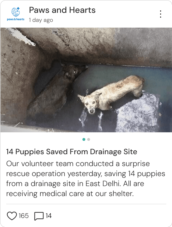
Example 'Impact
Stories' post
Example 'Impact
Stories' post
Example 'Organisation
Updates' post
Example 'Organisation
Updates' post
4.
4.
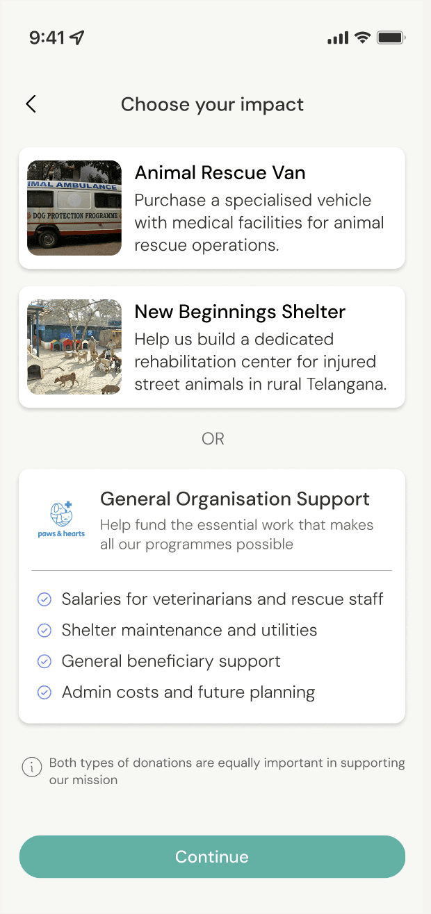
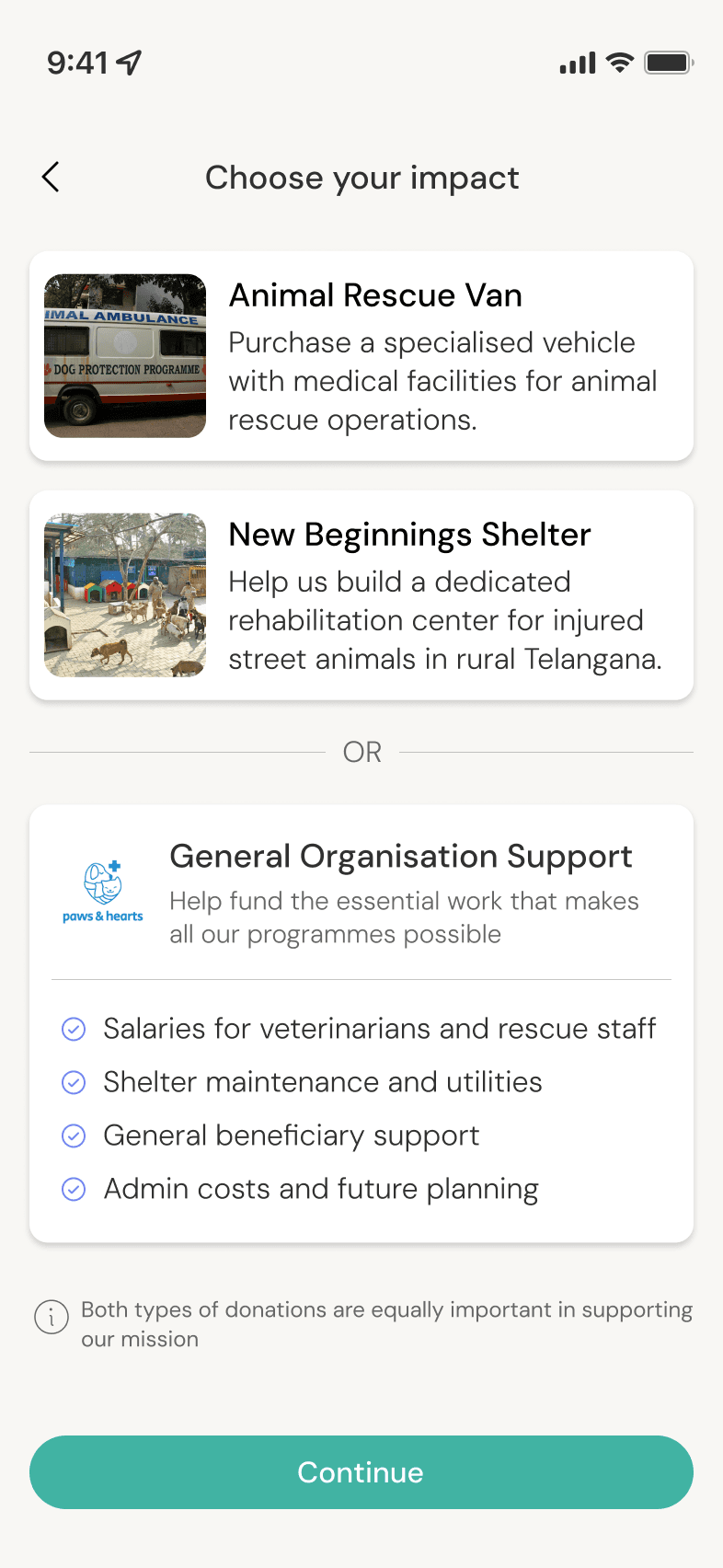
Users assumed donations to an organisation automatically went towards its active fundraisers, not realising these were separate donation opportunities.
Users assumed donations to an organisation automatically went towards its active fundraisers, not realising these were separate donation opportunities.
A
C
B
A
C
B
A
C
B
A
A
Added a step to the donation process that presents both options—specific fundraisers and general organisational support—making it clear these are separate opportunities
Added a step to the donation process that presents both options—specific fundraisers and general organisational support—making it clear these are separate opportunities
B
B
Outlined what 'organisation support' entails to create transparency
Outlined what 'organisation support' entails to create transparency
C
C
Added a caveat to specify the importance of both types of donations
Added a caveat to specify the importance of both types of donations
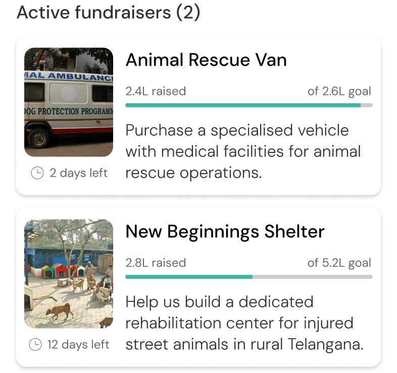
Active fundraisers on organisation profile page
Active fundraisers on organisation profile page
WHAT TESTING SAID
WHAT TESTING SAID
Users needed both emotional connection AND practical control—they wanted to feel moved by causes while maintaining agency over where and how their donations were directed.
Users needed both emotional connection AND practical control—they wanted to feel moved by causes while maintaining agency over where and how their donations were directed.
Users needed both emotional connection AND practical control—they wanted to feel moved by causes while maintaining agency over where and how their donations were directed.
100%
Task completion rate
5 of 5 participants successfully completed 5 of 5 tasks
4.6/5
Ease of use
rating
Average score given by users for 'ease of use' across all 5 tasks
4/5
Comprehension score
'Ease of understanding' score by users for tier verification
80%
App adoption
rate
4 of 5 users expressed definitive intent to use the platform if available
REFLECTING ON THE PROCESS
REFLECTING ON THE PROCESS
REFLECTING ON THE PROCESS
Addressing the market gap
Addressing the market gap
Based on the feedback provided, users see Small Drops as a platform that bridges the gap by:
Based on the feedback provided, users see Small Drops as a platform that bridges the gap by:

1.
Offering broad cause coverage without being overwhelming
Offering broad cause coverage without being overwhelming
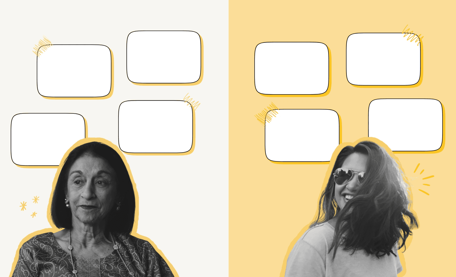
It feels really well organised, I like that I can find things to donate to this way. It's all in one place so I can be more intentional.
It feels really well organised, I like that I can find things to donate to this way. It's all in one place so I can be more intentional.
It feels really well organised, I like that I can find things to donate to this way. It's all in one place so I can be more intentional.
2.
Combining rigorous transparency with compelling storytelling
Combining rigorous transparency with compelling storytelling
The app genuinely feels legit, which makes me feel like the causes supported by the app are legit… it makes me motivated to donate
The app genuinely feels legit, which makes me feel like the causes supported by the app are legit… it makes me motivated to donate
The app genuinely feels legit, which makes me feel like the causes supported by the app are legit… it makes me motivated to donate
3.
Using modern engagement methods that work for younger donors
Using modern engagement methods that work for younger donors
I feel like the updates are really useful, it's more digestible with these smaller posts… the newsletters they send are too much
I feel like the updates are really useful, it's more digestible with these smaller posts… the newsletters they send are too much
I feel like the updates are really useful, it's more digestible with these smaller posts… the newsletters they send are too much
Final thoughts
Final thoughts
This project pushed me in ways I didn't expect. Here are three key things that stuck with me:
This project pushed me in ways I didn't expect. Here are three key things that stuck with me:
Research across different age groups can be crucial
Research across different age groups can be crucial
Without testing age differences, I would have built a generic solution that satisfied no one.
Without testing age differences, I would have built a generic solution that satisfied no one.
Without testing age differences, I would have built a generic solution that satisfied no one.
Aesthetic choices should serve functional requirements
Aesthetic choices should serve functional requirements
My initial visual design undermined trust. Visual design must support the product's purpose.
My initial visual design undermined trust. Visual design must support the product's purpose.
My initial visual design undermined trust. Visual design must support the product's purpose.
Trust requires transparency and emotion
Trust requires transparency and emotion
Users wanted both verification and emotional connection to feel confident donating.
Users wanted both verification and emotional connection to feel confident donating.
Users wanted both verification and emotional connection to feel confident donating.

IF I HAD TO DO IT AGAIN…
IF I HAD TO DO IT AGAIN…
IF I HAD TO DO IT AGAIN…
The biggest thing I'd change? Being more intentional about my design direction from the start. I didn't fully consider how crucial the visual design would be for this type of product, which left me quite lost during the design phase and required significant changes later on. I'd also test the final product with non-profits themselves to validate whether the kind of commitment this platform requires is actually feasible for them to maintain. Most importantly, I'd involve people who don't donate at all to test whether Small Drops could actually convert non-donors rather than just improve the experience for people already inclined to donate.
The biggest thing I'd change? Being more intentional about my design direction from the start. I didn't fully consider how crucial the visual design would be for this type of product, which left me quite lost during the design phase and required significant changes later on. I'd also test the final product with non-profits themselves to validate whether the kind of commitment this platform requires is actually feasible for them to maintain. Most importantly, I'd involve people who don't donate at all to test whether Small Drops could actually convert non-donors rather than just improve the experience for people already inclined to donate.